If you have been reading our blog (thank you!) you have noticed that I have recently posted some amazing before and after photos of a paint transformation. The right paint colour truly make a huge difference!
Paint is your backdrop, your canvas and with paint you can really set the tone for your decor style. Like all designers and decorators I definitely have our favourite paint colours but it really does depend on your light, existing finishes and the mood you want to set . I want to share with you our 5 favourite paint colours (and in no particular order)
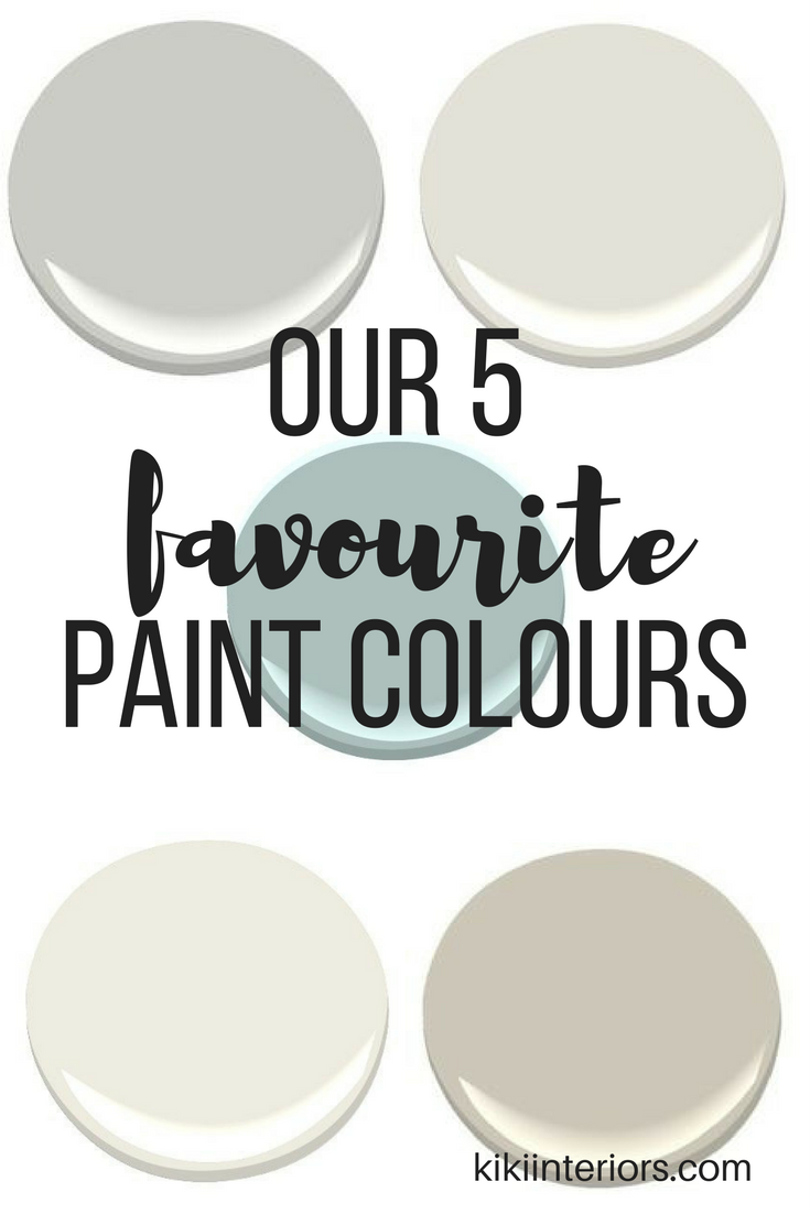
Here are my 5 favourite paint colours (right now)…

#1. Paint – Classic Gray:
Benjamin Moore ‘Classic Gray’ is a soft and light grey tone . It is on the warm side. It is a favourite of mine – I have used it with my investment clients – to give their rental properties a current and fresh look but still bright and clean. I am also using this in one of our ‘sample board’ projects for a townhome community in the city!

This stunning living room, designed by Studio McGee, is a great example of ‘Classic Gray’ walls – see how light and warm it is! Even Jillian Harris did a Home tour video of the home she just sold as was talking about her love of Benjamin Moore’s ‘Classic Gray’. These 2 amazing designers can’t be wrong!

#2. Paint – Stonington Gray:
Benjamin Moore’s ‘Stonington Gray’ This is a true grey tone that I have used a number of times. It’s a medium tone grey that looks great in space where you want to add just a touch a depth. It’s still very fresh and clean looking too! It’s from the Historical collection and works nicely with exteriors too. Take the tour of the Stittsville Walk model home and see how I used Stonington Grey in this space.

Stonington Gray looks great in this eat-in kitchen space! It makes the space look fresh and current and with all the big windows and natural light this colour adds depth without making the space feel dark. The white light shade, trim and chairs are a nice contrast to the grey wall paint.

#3. Paint – Swiss Coffee:
Benjamin Moore’s ‘Swiss Coffee‘ not a new colour but a new favourite of mine! It’s rich and creamy warm white and it’s amazing with the whole Farmhouse style. It’s so clean and crisp and looks great as a canvas for artwork and other decor pieces. I am using this in a model that I am working on right now – that’s launching in early June (stay tuned…)

This living room designed by Onekindesign.com – it’s incredible!! So now that you have taken in the beauty of this room, here’s why we love this paint colour. It really allows the other elements in the room to be the star and it pulls everything together. The wood and the stone really stand out and give the room a big WOW factor but that paint compliments and adds a subtle warmth to the room.

#4. Paint – Revere Pewter:
Benjamin Moore’s ‘Revere Pewter’ This is another paint colour from the Benjamin Moore Historical collection. This is a great colour for anyone who is a bit hesitant to jump into a gray paint colour. This is more a member of the taupe family or a warm grey.

You can see here, in the image above, how soft, neutral and warmth this paint colour is! It’s enough pigment on the walls but not too deep or intense. It is a great neutral taupe-y tone without any yellow under tones. It’s great for gender neutral space or even a boy’s bedroom – you can all the accessories and colours you want and they will work!

#5. Paint – Wedgewood gray:
Benjamin Moore’s ‘Wedgewood gray’ is a beautiful shade of blue. Typically I am a big fan of neutral walls but if I had to pick a colour it would be something in a shade of blue. This is a great colour for certain areas of the home that you want to bring colour into with art and accessories so for instance a mudroom or front entry. There’s usually a lot of trim, flooring and other hard textures, so a bit of colour on the wall breaks it up a bit.

So here’s an entry painted out in Wedgewood Gray – it’s such a fresh and clean colour. The white trim and wall paneling really pop too. The hall tree is painted in Kendall Charcoal – both Benjamin Moore colours – it’s a great colour combination with the white and blue.
So these are my 5 favourite paint colours right now….what do you think?


SHOP FARMHOUSE FAVOURITES …

interiors.kiki
You May Also Like


Holly
Thank you for posting this!!! I plan on saving it for later, i have a hallway that needs some love and i love your color choices!
13 . 04 . 2017kikiinteriors@rogers.com
Thanks, Holly! These are my faves right now … they work in almost every house! Glad I could help 🙂
13 . 04 . 2017Lori | Choosing Wisdom
Love these colors! They have a clean and soothing feel to them!
13 . 04 . 2017kikiinteriors@rogers.com
Thanks, Lori – our lives are chaotic enough I feel our homes should be calming….thanks for the feedback!
13 . 04 . 2017Corey | The Nostalgia Diaries
Love the stonington and Wedgewood! Such lovely choices… makes me want to do some painting!
14 . 04 . 2017kikiinteriors@rogers.com
Thanks, Corey! I love them too – and they would work so nicely together too….
14 . 04 . 2017Ilka Elise
I love the Benjamin Moore Classic Gray.. we pal on using it when we move in summer <3
14 . 04 . 2017Lovely list, thank's for sharing xx
kikiinteriors@rogers.com
We have used Classic Gray a lot! It’s really universal and it adds just a touch of colour on the wall without being dark or overwhelming! Good luck with the move, Ilka!
14 . 04 . 2017Julie I Aloha Lovely
Love all these colors! They are so “beach chic”. I don’t think you can go wrong with any of them. aloha!
14 . 04 . 2017Julie
http://alohalovely.com
kikiinteriors@rogers.com
Thanks, Julie – One thing I love with these colours is how versatile they are! You can use them in a beach house look or a farmhouse!
14 . 04 . 2017Lindsey
I’m loving the grey!!!
14 . 04 . 2017kikiinteriors@rogers.com
I love it too – Grey can be warm and inviting!
14 . 04 . 2017Sarah O
Hi, loving the reVere pewter. Would you please tell me what “white” you use on the ceiling to complement it? Thanks sO much! Sarah
18 . 02 . 2019kikiinteriors@rogers.com
Hi Sarah! I love Revere Pewter too! I have 2 picks for white when it comes to ceilings, trim etc….if you want a super crisp pure white I suggest Decorator’s White (Benjamin Moore CC-20) but if you like a white that has some warmth – don’t worry it’s not ivory it is white – I recommend Cloud White (Benjamin moore CC-40). Either will work with Revere Pewter! Good luck with your painting project and let me know which white hue you choose!
19 . 02 . 2019Carole
I am looking for a living room color that would be timeless and go well with gray owl and stonington in the adjacent room, I was thinking Swiss coffee might be the one after reading your blog, would these colors sit good next to each other? I had considered ballet white but I think it’s too light in color? What are your thoughts or suggestions?
04 . 05 . 2019kikiinteriors@rogers.com
Swiss Coffee is a great choice – it is very clean and still warm. I would also suggest White heron – I’m using that in my latest project. It is a white shade with a slight grey undertone so it will work well with gray owl and stonington grey.
05 . 05 . 2019Carole
Thanks for the response. I considered edgecomb gray but feel it’s too cool for my space. IS white HEROn the same hue as Swiss coffee? I currently have straw hat that has to go as it is looking on to gray owl and stonington gray. I need something timeless and classic for this space that works in good contrast to the grays. Should I stay light or a deeper hue of the color you suggested. I am having a juggle picking the right choice. Thanks again 😊😊
06 . 05 . 2019kikiinteriors@rogers.com
You can’t go wrong with White Heron oc-57 or Swiss Coffee oc-45 – I would say Swiss coffee offers a bit more in terms of colour…but both of these choices are in the Benjamin Moore ‘whites’ palette. Yes, Edgecomb grey – is a great colour but it doesn’t work well with your palette.
07 . 05 . 2019Carole
Yes I do agree the Swiss coffee offers more in terms of color like you said and I do want some color. What are your thoughts on Lancaster whitewash and old prairie, I came across these today in terms of sitting adjacent to gray owl, stonington & revere pewter down the Hall? They All look a bit close in hue. ARE any of these colors familiar or ones that you use often?
I AM really enjoying your site and am so glad that I found you on pinterest.
Thanks ☺
08 . 05 . 2019kikiinteriors@rogers.com
Oh thank you, Carole – you are so sweet! I love Old Prairie and I have used this before – it’s lovely! It’s just fallen out of my rotation but thanks for the reminder! I do like Lancaster Whitewash and I used it a few years ago on a heritage project. It is close to Edgecomb grey so it is much warmer compared to OP and definitely more in the beige camp. So I would personally opt for old prairie – it will offer nice flow with the other paint choices. I hope this helps!
09 . 05 . 2019