Browsing Category

HOME STYLING

top-10-most-inspiring-home-decor-accounts

As a home decorator and blogger – I am always looking at social media, TV shows, magazines and well everywhere… I’m always searching for inspiring design and decor for myself and for my clients.  I have noticed through my own social media that my own style has evolved over time and no doubt this is due to all of the inspiring images. I follow so many home decorators and designers on Instagram but I definitely have some IGers that I find so inspiring…

Inspiring Home decor

Lately I am drawn to simplicity, clean lines, neutral tones and accents in blue.  I personally love a mix of styles but I do love a modern farmhouse look. Being a mom of 4 I need ideas that allow for storage and also family life. I love mixing textures, too!

Top 10 Most Inspiring Home Decor Accounts on Instagram

1.The Coastal Oak

The Coastal Oak is a new source of inspiration for me. I just discovered this account and I absolutely love it! Simplicity at it’s best – I love the neutral tones.  Wood and blue accents too – plus how Amy is real about family life!


2. Craftberry Bush

This account (mscraftberrybush) is just stunning – you need to follow this account right now – her Christmas decor is just breathtaking! Again, gorgeous design and beautiful blend of neutrals and textures! I love Lucy’s style…


3. Life on Virginia Street

This is just one of the many inspiring photos on Life on Virginia Street. I love Sarah’s taste – and her blog (and Instagram) she shares more than home decor – there’s fashion + beauty, DIY, recipes and more.  Her home yours are so inspiring and she shares her shopping list, too!


4. Project Allen Designs

Ashley is one of my favourite IG accounts – Project Allen Designs – I love her clean and simple style! Her home is stunning and her bedroom has totally inspired my master bedroom update(which I will be sure to update you all on).  I love how she also shops at ‘everyday’ places. I cannot wait to see her kitchen update!


5. Kind+Abell

Kind+Abell is another account that inspires me because Emily has such a strong sense of family and incorporates that in her designs. Family spaces can be beautiful, too! She creates spaces for everyday living which I love!


6. Jonesville Blog


Can you tell I am looking to update my bedroom? Jonesvilleblog is an account that I love – I first saw Elizabeth while participating in the $100 room challenge and I could not believe what she was able to do with such a tight budget. I love her latest project – her master bedroom!


7. Rachel Elizabeth Creates


Absolutely stunning! I look at her IG feed and her amazing blog and I can’t help but feel inspired! Her esthetic is so calming and warm – I love again her use of soft tones, elements of nature and simplicity! Her home tour is a must see!


8. Within the Grove

Another hands-on home decor and DIY account that I love! Liz at Within the grove opens her home to us and shows us what she’s doing and gives us an honest look at her amazing DIY projects! Plus she shares weekly home decor sales!


9. Revival. Farmhouse
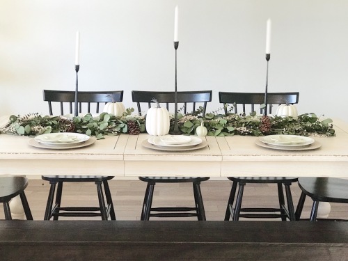
I love Kristen’s sense of simple design and decor – I’m not a fussy person so her esthetic really appeals to me! Her account is all about her own farmhouse and turning it into a home! This dining room and tablescape is totally inspiring – giving me some great ideas for Christmas!


10. Hailey’s Hacienda

Hailey has a beautiful eye for simple styling and perfecting balance in home decor.  I love her mix of textures and modern lines – her taste is amazing and she is one to follow! She shares her DIY projects and styling tips. Her account is beautiful and i know there is so much more to come!

These are the Home Decor Instagram accounts that are inspiring me these days – do you have any favourites?


2 comments
Share:
how-to-decorate-your-fireplace-mantel

The fireplace is one of my favourite features in a home, it might be my favourite because I am always cold….

The fireplace is also a major focal point in the room that it is in – so your decor with be on full display.  A fireplace is a great canvas for decor and I love changing up my decor with the seasons and the fireplace is a perfect spot for that! There are a number of ways to decorate that mantel, personally I love a mix of pieces anchored to the wall and some that are layered and leaning – it gives a casual feel to the room. Mixing decor pieces like vases of various sizes, photos, candles and mirrors are a great way to add personal style. And greenery or florals … they add so much life to any room and on the fireplace they are front row center! Don’t forget the hearth – baskets, pillows and blankets also help balance out the entire focal point.

Here are some great ideas to inspire your fireplace decor:

Photo credit : The Frugal Homemaker

Coastal –

In the summer and spring months, the fireplace is overlooked – we aren’t using it so why decorate it? Well the fireplace is still a part of the room so keep it decorated with seasonal pieces.  I love the beachy accents around this fireplace – the area looks light and breezy. And I love a pop of yellow!

Photo credit : Magnolia

Modern Farmhouse –

This is so clean and crisp which plays into the modern look but the textures like the wood accents, and the natural accessories add that fresh farm feel.  I love the use of black in this room – the fireplace itself is black and balanced out with the black photo frames. The small pops of greenery add life to the room as well!

Photo credit: A Blissful Nest

Balance and Colour –

I love turquoise – it’s bright, bold and fresh! It is brightening up this room without taking over. It works beautifully with white and that splash of coral-red adds another punch to this room.  I also love the balance of the accessories – did you know that the eye is natural drawn to symmetry and balance? So that’s another layer that makes this fireplace decor so attractive. The large art piece at the center offers height and fulls that wall and the various sizes of the glasses vases not only brig in the balance but they fill up the mantel space – it is full of decor without looking cluttered. The glass pieces also bring a lightness and reflect light keeping the whole fireplace from looking heavy!

Photo credit : Twelve on Main

Rustic Farmhouse –

So cozy! The stonework surround has so much texture that you really need to work with that and add other textural elements in this room.  Textures like the straw from the hat, the small glass vases add a smooth texture plus a dash of colour and the magnolia wreath add more colour and natural texture (even if it is faux). The white pieces lighten and soften the whole look. This fireplace has a great mix of rustic and farmhouse which makes this entire room so laid back but stylish.

Fireplace Decor pieces:

Art is a perfect way to add some colour and movement to your room – it is also a great way to add an anchor to the room. This art piece adds some real interest and colour to any room – it would look great in a contemporary space.

A stool is a great way to add some extra seating for when you have large gatherings – it can also be sued as surface space for snacks for beverages but it also adds another textural element to the decor at the hearth. Garden stools like this one do come in many colours and some even have multiple colours or patterns.

Candles and candle sticks are a great way to add some height to your fireplace decor – I like the texture element that they add, too! Lighting candles mixes up the mood in your room. These candle sticks work so well with the farmhouse style – so another reason why I love these!

Greenery or florals always add life to any room – I personally like to keep it simple with one type of foliage in a vase or wreath – it looks so clean and adds modern simplicity. I have a magnolia wreath on my door and it works all summer and spring – I do switch it up for the fall and Christmas but I bring in my magnolia one and add it to either my fireplace or my gallery wall. I love the classic look of the magnolia wreath.

The fireplace isn’t necessarily in use everyday but it is in your space so be sure to space some time decorating it even when it is not the season for cozy nights by the fire.  The mantel (and hearth) are a perfect opportunity to showcase your style – the fireplace mantel isn’t just for TVs anymore!


SHOP FIREPLACE SHELVING AND DECOR….

0 comment
Share:
get-look-small-front-entry-scandinavian-style

If you have a small entry by your main door do not think that you cannot have a functional space with style. A recent client of ours was struggling with this dilemma of a small (almost not entry – as there was no defined entry space) and she needed a spot for keys, mail, last minute make up check before heading out and of course, a touch of style.  She is a huge fan of Scandinavian style with the function and minimal decor and in a small space this really works!

Small Front Entry Inspiration

Photo credit: Homeyohmy

When it comes to finding inspiration for projects – starting online is the best! There is an endless supply of styles, looks and overall ideas.  I stumbled upon this image and this was just perfect! A beautiful balance of style and function – just what our client was looking for in her entry.

We made a few tweaks to this look in order to suit her space….

Shop the look : Small front entry with Scandinavian style

If you do not have a front hall closet or really much closet space – you need to get creative.  a wall mounted hook is a perfect solution to hang up what you need – jacket, sweater, hat even a dog leash…


Beaton Wall Hook is unfortunately no longer available but here is a similar option
from: Wayfair

A narrow console table is a must in a small entry – it offers some great surface space for a small bowl for keys, loose change and mail – it’s also a great spot for some extra lighting or a touch of decor.


George Oliver Woodbury Narrow Console Table – this model is no longer available but here is a similar option
from: Wayfair

A mirror is a useful ‘tool’ at a front entry as it allows for last minute checks before heading out the door plus a mirror makes a space appear larger, so if you have a small front entry – this can really help open it up…..


Beachcrest Bonnie Coastal Wall Mirror
from: Wayfair

A basket is perfect for storing items that you still need regular access to – for instance mittens, hats, yoga mat, umbrella and pet supplies like toys….I love the natural texture that these woven baskets bring to the vignette.

DUFMOD Large Natural Basket

from Amazon

I love the texture and pop of colour that plants add to a space – if you don’t have a green thumb don’t worry! These preserved eucalyptus branches don’t need any extra care just add them to a vase and you are done!

Preserved Eucalyptus Branches

from Amazon

This fluted pure white vase is the perfect piece to hold your eucalyptus branches – I love the simplicity of this vase and of course you could use it for fresh flowers anywhere in your home.

White ceramic fluted vase

from Amazon

Some type of seating is really ideal by the front door….so this minimalist looking 3 legged stool is just perfect for anyone needing a spot to sit while putting on or taking off their shoes.  This one fits beautifully under the console so it doesn’t take up a lot of the space and I love the mix of natural unfinished wood with the dipped legs in black.

Small wood 3 legged stool

from Etsy

This look is so fresh and clean yet functional – I just love it and so does our client!


1 comment
Share:
farmhouse-style-popular

Why is Farmhouse style so popular?

Farmhouse home decor has been a popular ‘trend’ for some time.  In recent years we have really seen this style rise in mainstream popularity.  The influence of country style home decorating isn’t new – I remember growing up with a kitchen that had a brick accent wall, oak kitchen cabinets and a wallpaper border with chickens, cows and pigs….(can you any of you relate?).  But the farmhouse style that we see today is less literal and more inspired by the idea of ‘farm life’.

Photo credit : 99architecture.com

Farmhouse style is popular for a few reasons…

1 – It is warm and approachable which (I believe) is the feeling that most people want in their home for themselves and for their guests.

2 – It’s a pretty versatile style that mixes well with other styles like industrial or traditional.  You can really play with the amount of country inspiration you want in the space.

3 – It’s family friendly.  The materials and finishes and the overall relaxed nature of the style works for families since the ‘chippy’ furniture already looks aged and a lot of the wood and metals already have dull finishes (plus a few dings and nicks) that add character.

4 – It’s everywhere!  It is easy to find at local and online stores … plus it is widely seen in the media.  With TV shows like Fixer Upper as an example, we are exposed to this style on a regular basis.

What is ‘modern farmhouse style’?

Modern farmhouse style is the ‘country’ home decor style of today.  It consists of country inspiration with a modern or urban edge.  So we still see home decor pieces with chippy and dull finishes, reclaimed barn wood, ‘used’ or ‘found’ decor items like old windows or pickling jars; brick walls, and even farmhouse signs plus the odd farm animal.  But with these typical farmhouse elements they are blended with modern influence like more monotone decor – lots of shades grey and white.  We also see a cleaner look – many of us think of country being a bit on the cluttered side. Displays are simple – like floating shelves with styled decor items like wood bead garlands and recycled glass vases and even floral arrangements are streamlined.

Photo credit : Damask et Dentelle

Farmhouse inspiration…

One of the many aspects of farmhouse style that I love is that it is so easy to update your space (even on a budget).  Here are some modern farmhouse images for inspiration on how to bring this style into your space…

Photo credit : Fox Hollow Cottage

Reclaimed wood elements like this amazing ceiling beam add so much character to a space.  And when you have this kind of character contrasting with clean white cabinets and walls – it is so fresh and still warm. The hand scraped wider planks hardwood floors add that farmhouse feel as well. The vignette with the glass pieces, antique clock and that chalk board really embrace the ‘aged’ look of farmhouse but this display has a clean colour palette. The reclaimed wood harvest table adds more character and contrast to the pure white elements in the space. The large dough bowl is a great centerpiece for greenery or seasonal fruit like apples in the fall months.  This dining area is modern farmhouse at it’s best!

Photo credit : Pine and Birch

This entry is farmhouse fabulous! It has the clean and crisp white walls that we often see in more modern homes but the shiplap detail adds that country house feel.  The wall display (gallery wall) is simple and with the crisp colour palette has a slight modern touch.  Adding ‘found’ pieces like the stunning church pew is genius (you need seating at your entry) and it adds character to the space.  Details like the sisal rug, galvanized metal boxes and the glass vase with greenery shows off that mix of textures that I love.  The buffalo check pillows on the pew have more country but in the grey / black and white scheme they feel more modern. This entry is a perfect example of modern farmhouse.

Photo credit : Twelve on Main

This modern farmhouse master bedroom is just dreamy….The layers of warm white in this room make it calm and peaceful and the black accents like the sconces, the barn door hardware and the chandelier add a rustic touch.  The white sleigh bed has a country feel. The paneled wall detail  and the tufted arm chairs add  bit of traditional elegance without being stuffy. And those exposed wood beams… bring in that great natural texture and wood grain adding incredible visual interest, that same texture is also seen as an organic side table being the arm chairs.  Other details like the greenery and the soft textiles on the bed and chairs make this bedroom so calming and soothing. A beautiful farmhouse bedroom retreat that I know I would never want to leave….

All of these farmhouse rooms have a unique look while still embracing the textures of country and the clean elements of modern design. I love how you can take this style and really make it your own – mixing with other style is a breeze, too!

Are you inspired by modern farmhouse decor?

SHOP FARMHOUSE…

6 comments
Share:
home-tour-warehouse-loft

This warehouse loft model home is a past project of ours….we blended some of the typical warehouse loft elements like brick walls and industrial lighting with some fun accents of colour.  We love to play with mixing textures and adding some fun and quirky elements….

Loft elements – the ‘expected’ …

Often when we think of a loft style we think of raw materials like brick or concrete, wood and metal.  This loft model suite has a lot of those materials.  The kitchen lighting with an industrial look (above the island), the wide plank hardwood floors, the muted wood grain cabinets, the oversized black trim windows and that brick accent wall….are all seen here in this space.

and the unexpected….

Typically in this style of decor we see a lot of texture from raw materials but we see mostly neutrals – we decided to add some great colour and pattern – so this is the unexpected factor in this model loft.  This rug was a piece that we fell in love with and the bold teal tone is not something you often see in this decor style – that was one of the first pieces we found and wanted in this space.

The teal and the orange tone from the brick wall are natural complimentary colours – so we knew that this would work but it was unexpected.  We sourced out a simple and clean looking sofa in a great neutral tone would be a great canvas for some fun pillows.

We carried this bold colour theme into the bedroom as well for some consistency to keep the whole space looking fluid and therefore larger.  Looking at our inspiration vision e-decor boards – our final product isn’t that far off….

Loft model – take the tour…

See the end results of this model space –

Shop the loft look….

This art piece from Urban Barn is a favourite and it looks fantastic in the bedroom – it is a large piece (and we love oversized art) and would look great above a sofa…

These counter height stools in metal wire with a white leather seat are actually really comfortable – They offer great seating at the kitchen island but because of the wire detail they don’t look bulky and visually take up space.

Lighting makes a huge difference in a space and this industrial kitchen island pendant from Wayfair – really plays into the look of the space.

Metal is a big element in loft decor – we love these metal and stack-able bistro chairs – they are also easy to clean and as they age over time – it just adds character.

Warehouse industrial style is really unconventional and doesn’t really follow any rules – it easily blends with other styles which is just one of the reasons it is so popular…

2 comments
Share:
decorating-buffalo-check

What is Buffalo Check?

This pattern is also known as Buffalo plaid.  It originated at Woolrich Woolen Mills in the 1850’s. This pattern is traditionally seen in red and black but over time there have been many colour variations.

Photo credit : hm.com

The pattern is often 2 or 3 colour striped fabric creating equally sized large squares (gingham is similar but the squares are much smaller).  Buffalo check had a real moment in 2015 holiday decorPlaid is always a popular choice at Christmas and this pattern fits the style plus with the popularity of woodland inspired decor the pattern is a perfect fit!

Photo credit : Etsy.com

Buffalo Check and Home Decor…

This plaid print works very well when paired with a rugged and rustic look (think ski chalet) but in other colour variations it can also work in more transitional, farmhouse and traditional styles.  Buffalo plaid can be used in many different ways – ranging from upholstery to table settings. Here are some of our favourite rooms with Buffalo check.

Photo credit: Simons.com

This bedroom has a rustic mountain home look with the traditional red and black Buffalo plaid pattern.  Paired with the cowhide rug and shiplap walls – this room has a rugged and cozy feel.

Photo credit : Magnolia Home

Add a touch of country to your walls with this water colour effect wallpaper in Buffalo plaid print – the black/grey/white colour scheme is very neutral easy to work with.  It pairs beautifully with the wood tones and the simple and clean bedding – the style in this room has some mid century modern elements but it works with this check pattern on the wall.

Photo credit : Damask et Dentelle

Pillows in a Buffalo plaid is a more subtle way to add this print into your decor.  Again the black / white/ grey plaid print is a great addition to any space – this is beautiful at a front entry bench, living room, bedroom and this dining banquet.

Shop Buffalo Check

Here are some of our favourite home decor items in rustic inspired pattern…add this print to your space this fall or winter to bring that cozy feel in your space.


Personalized Buffalo Check Throw


Urban Retreat 33′ x 20.5″ Buffalo Check Wallpaper


Twill Buffalo Check Cotton Throw Pillow


Philomena Classic Buffalo Plaid Check Table Runner

Buffalo Check Door Mat


What do you think of this classic yet rugged pattern?

0 comment
Share:
stittsville-walk

Stittsville Walk is a community that is currently under construction. I recently sourced and styled the model home just last month.  It is located in a great nook of the city and we love the quaint feel of main street mixed with the chic style of the finishes in this model.

Stittsville Walk – Take the Tour:

These newly built townhomes are perfectly located in this village like setting – the exteriors have a timeless colour pallete with a touch of a modern edge, take the tour inside to see the amazing features and finishes of Stittsville Walk.

I wanted the look to appeal to a younger demographic so I opted for some furniture pieces that suited a first time home buyers but also interior finishes that embraced what’s current without being too trendy.

I love a two toned kitchen but I wanted the look to be light an airy – so I stuck with a classic white shaker style cabinet in the main part of the kitchen.

I then decided on a ‘driftwood’ tone for the kitchen island – this cabinet has a grey-ish hue with a visible wood grain.  The light fixture adds a bit of an industrial element with the metal ‘pipe’ look and vintage bulbs, along with the grey industrial style stools.

The living room is a blend of soft grey tones, cow hide, reclaimed wood and some knitted textures. I didn’t want to add too many bold colours in the space – so just a pop of bright yellow pillows is all you need! A series of three mirrors with wood frames fill the wall space by the sofa.  This living room is cozy but also chic!

This designated dining space suits a mix of modern ad industrial styles.  The Eiffel chairs in white echo the white kitchen cabinets – when I design I love to see common threads throughout an open space to make the connections throughout the entire look.  These chairs are a classic modern element and I love the contrast with the table.  I added some simple small storage with the glass console table and these accessories add some visual interest.

Stittsville Walk – Get the Look:

I found these amazing pieces for great prices…let me show you how to get this look!

I wanted some grey colour on the walls but nothing too deep, too dark or too blue….what did I pick? Benjamin Moore’s Stonington Gray. It is become one of my favourite paint colours to work with …

30″ Bar stools  These come in a bunch of colours – neutrals to brights – I opted for the light grey to keep the space looking very light and clean.


This 12 bulb light fixture has a bit of a mid-century modern look but if you change out the bulbs to a vintage bulb (like I did) the look is much more industrial

A pouf is a great alternative for a traditional foot stool, it is also a good seating option if you are in need.

In smaller spaces, it can be challenging to find the right size furniture and we struggled with finding a coffee table so instead we used 2 of these wood accent tables instead.

SHOP THE LOOK…

This cinema light box from amazon is a fun accessory to any space – we love it in the dining room but it would be fun in a den, office, TV space, styled in a bookcase….so many possibilities!

I love the versatility of Eiffel chairs – they add that classic mid-century modern look to any space giving the whole room an updated look.  I found these white Eiffel chairs with wood legs on Wayfair.

I added another great light fixture to the space – over the dining room.  Because the fixture in the kitchen over the island was so visually interesting I knew the one over the table had to work with the industrial styling of the larger chandelier but it had to be simple.  I found this one – on sale at Lowe’s – I love the simplicity of the pendant paired with the pieces in the room, it has a touch of a scandi-industrial look

I love how this model home at Stittsville Walk came together,


10 comments
Share:
10-things-every-living-room-needs

The living room is where you entertain, relax, read, maybe watch TV but it is the most ‘public’ space in your home and sure, you can count on the sofa, the coffee table, and a few additional seating options. But the room needs to be personalized through decorative touches. Here’s some inspiration on how to add those personal style items to your space to give it a polished look

1 – A place for your books –

Your collection of first editions aside, designate an area to feature a few choice titles that complement your style. If your space is small, try blending the book case colour with the wall colour – it will look luxurious (like built-ins) and it will look streamlined

2 – Window treatments –

An empty window space is an incomplete one. Dress the frames with a set of drapes to maximize the height of the room, providing it with a simple yet elegant finish. Drapes also add softness to a room and they frame a window beautifully.  If you have blinds already add the drapes they really add a touch of style

3 – A styled coffee table –

A well-curated table keeps essentials on hand – minus the clutter. Stick to things that make like favorite books, vases, or trays. No, the remote control does not count as an essential or an accessory!

4 –  Something on the walls –

We’re all about the walls. Gallery of frames. One eye-catching print. An over sized mirror. Choose to decorate with pieces that will make the space totally your style.

5 – Pop(s) of colour –

Offset a neutral palette with hints of an eye-catching hue. It’s the key to an instant uplift. Accent pillows, art, accessories and even an area rug are easy ways to add some colour to your space.

6 – Painted walls –

A can of paint really is the easiest way to add personality to a room. As for the color, well, that’s up to you.

7 – A side table

A simple accent piece doubles as a geographically-convenient (and temporary) spot for all the necessities for a little lounge time. Plus these come in very handy when entertaining

8 – Personal touches –

Dedicate some shelf space for an edited assortment of pieces that reflect your personality. Throw some favorite framed photos to the mix as well.

9 – Light fixtures –

A little lighting goes a long way. If you don’t have a ton of natural light, then bring in table lamps to set the right mood for your space.

10 – The right seating arrangement –

Small space. Large space. We can’t stress this enough. It’s important to think about the shape of your room and its function. Arrange for how you will be using this area.

Make your living room a comfortable and chic space – if you are like me you spend a lot of time in that room so enjoy the space and make it beautiful,

1 comment
Share:
what-is-e-decor

So what is our e-decor service?

E-decor is an interior design service that we offer for clients who love our style but don’t live in our area or clients who don’t mind doing the leg work but don’t know where to start.  The beauty of this service is you don’t need to live near by, we source items that you can purchase online and have delivered to your door and you can move at your pace as your timeline and budget allow…

How does the e-decor service work?

Our e-decor service is so easy! First, we do need to know which room or rooms you want to design and decorate, we love to know a bit more about your taste and style (sending us photos of rooms you like is perfect!), we need a rough budget to work with (we all have a budget and we believe that style doesn’t come with a price tag), photos and dimensions of your room(s) (in the case of a property under construction, a floor plan is perfect), and we also want to know what purpose you want the rooms to serve, for example – TV room, guest bedroom / home office etc…

Next, we prepare a quote for you and once approved we get started!  Depending on the size of the project this could take anywhere from 2-4 weeks. We send you a vision board with the furniture, art and accessories – you have the opportunity to then critique and we make the changes to produce the final concept.  We also provide a sketch with furniture placement and a series of styling tips (for example art placement)


E-decor is perfect for someone moving into a new home or space, some one who is short on time and someone who wants a designer space but doesn’t know where to start. E-decor is a great gift too! We love to work with clients and make their spaces come to life so they can enjoy life and their space without the stress that can come with it!


2 comments
Share:
timberwood-towns-get-look

What is TimberWood Towns? Well if you have been following us on Facebook or Instagram – you have seen this amazing project that we have spent the last 6 weeks of our lives working on…It’s been a while since we have posted anything new but we hope this makes the wait worth while…..

TimberWood Towns is a new townhome community here in Ottawa and we had the amazing opportunity to design the sales center, the model and select all of the finishes top to bottom – it was an incredible experience, we learned a lot and created something beautiful!

It was a full 6 weeks – of selecting all the finishes for this project from flooring to paint to plumbing and lighting and everything in between. When you work with such a tight timeline you learn a lot about working together as a team, you also learn a lot about working with items that are in stock! We wouldn’t have been able to get this done without the pure magic of online shopping! Stores like Wayfair, Amazon, and Bouclair really came to the rescue! We have some amazing ‘friends’ at Urban Barn and they really pulled though with large and small purchases for this project! And of course, Home Sense (to our US readers, this gem is coming to the States soon and you will love it!)

Let us breakdown what we did in the space to create this industrial farmhouse look…

Reclaimed Wood Accents:

The look at TimberWood Towns is industrial farmhouse.  We mixed a lot of great texture in the finishes but also the furniture and accessories.  We found so many amazing pieces that really pulled this whole look together.  Our construction team found an old barn (a little over an hour’s drive out of the city) which is where we found all of this reclaimed barn wood for the accent wall in the den and to create these beams (which are included in every one of these townhomes, what a great architectural feature!)

Creating contrast:

A big part of this look was to create contrast so that the wood was a highlight but the the white walls and lighter furniture pieces really added to the feel.  You can definitely get contrast with colour but you can also get contrast with textures.  We needed to balance out the hard and rough texture of the wood with some softer elements – like these white linen chairs, leather sofa and lots of pillows. We added some rope texture to the space too – the pouf, the rope on the large clock and even some photo frames with a rope accent. Another great texture in this space is the cowhide ottoman.

Lighting :

We all know that lighting can totally transform the look of any home and this project was no exception! We needed some great lighting that would really help set the tone of this industrial farmhouse look – we found some amazing pendant for the kitchens (that’s right, we have 2 kitchens in this sales center) and bathroom. We used aged bronze finishes for the lighting as they really add a rustic touch to the space.

More TimberWood Towns …

TimberWood Towns Shopping list:

If you like this industrial farmhouse look – you are in luck! We have a list of the items we purchased for this beautiful showroom.

These are just some of the amazing pieces we used in this project – we love to mix styles but also price points. when you mix styles and price points, you end up with final product that is truly one of a kind. We love how all of these items come together in a cohesive and unique way…

Let us know which piece is your favourite, we can’t decide!

21 comments
Share: