Browsing Tag

kiki interiors

get-model-look-at-home

Have you ever toured a model home and wished your space could look like that?  Or admired some key pieces and wanted them for your own home?

Well wonder no more…..with the help of KIKI Interiors and Wayfair.com you can get the  model look in your home.

It’s easy too.  Click here to get directly to the kiki interiors gallery and you will see a series of different looks.  Each image has various highlighted items and wayfair.com has already done the shopping for you!

To get the look at home you may just need a few pieces or a fresh new colour palette.  We hope our gallery inspires you!

Here are just some examples of the model homes you will find in the KIKI Interiors gallery on Wayfair.com


An urban condo with high gloss grey cabinets, quartz counter tops, over sized industrial pendants and pops of orange and turquoise. The pops of orange came from the Pantone Colour of the Year (at the time) ‘Tangerine’.


A mix of modern and ethnic elements.  Lots of layered neutral tones with texture and clean lines. Don’t be afraid to mix natural materials and textures with more modern pieces.


A condo where classic and contemporary meet.  Pattern, bright pops of apple green, yellow and teal, nail heads, glass and more…


Where contemporary meets industrial, a mix of metal, brick, shades or grey and stone…


You might be thinking – “Wow, that’s a lot of different styles of model homes” – When we design what the model home is going to look like we take a lot of different factors into consideration.  Who is the buyer? What is the price point / budget? What are the current trends? What are we working with in terms of space (lots of light, interior finishes etc…).  When we design and decorate we aren’t doing it for ourselves – we are thinking of it as a sales tool and not just a ‘work of art’.  A model home is meant to inspire and attract…

0 comment
Share:
how-to-set-your-table-for-dinner-party

Many of us are spending more and more time entertaining from home as opposed to going out.
With budgets tighter, staying in is a much more bank account friendly option these days. Inviting friends over for dinner parties is more in fashion than ever! There are many aspects of a having dinner party…One of them being the table setting! In this blog, we will help you set your table for a dinner party, and of course, show you how to make it beautiful! 

Your table setting is a great place to let your personality shine through. Do you love colour? Use it! Are you into geometric patterns? Great! Use them on your napkins or placemats! Love bold prints? Add a fabulous printed table cloth!


There are so many fun ways to make a great tablescape.


First of all, let’s start with table linens.

Are you using a table cloth? Or are you looking for a more modern look and just using decorative place mats? Maybe neutral tones on your napkins? Either way, having one or all of these options will be great! The napkin can either go to the left of your plates or on top of the plate, folded nicely!


Now that we’ve laid the linens down (napkins, placemats, and/or tablecloth)

We need to add plates. Depending on how formal you want to be, this will coincide with the amount of plates you need to add. (See the below diagrams and see which appeals to you… formal or casual.)


The above photo shows a very formal dinner setting. For casual entertaining, we recommend using a charger and a dinner plate on top. A charger is a large, decorative dinner plate that usually goes underneath the service plate (the one we use for eating.)  A charger just adds a punch of colour or texture or pattern to the place setting.

I recommend having an extra plate available for a more casual setting for salad and/or bread. It’s
more convenient for your guests. With a formal setting, this is a must-have.

Next, onto flatware.

For a formal setting, you will have 3 forks, at least 2 spoons and one dinner knife as well as a bread knife. The forks will be three different sizes, one for salad, one for dinner and one used for dessert. The two spoons needed are a soup spoon, which is slightly larger than the dessert spoon.


For casual entertaining, one of everything is perfectly acceptable. An extra dessert fork and spoon is a nice touch though. Supplying one fork, spoon and knife for dinner is just fine.


Next, you need glasses.

For formal entertaining, a white and red wine glass is placed on the top right of the place setting along with a water glass. After the meal has begun, most guests will chose either a white or red wine and the unused glass can be removed. Once dinner is complete, the addition of a cup and saucer is brought to the table for coffee or tea.


Casual entertaining includes a water glass and a wine glass. Depending on your guests or your glass collection you may only want to offer a neutral wine glass. There are many different types available that are great for multi-purpose and casual settings.


And last but not least…

You’ll want to make sure you have a beautiful centerpiece. This goes for both formal and informal dining. A centerpiece is a necessity! There are so many different centerpiece options: you could use flowers, candles, or unique conversation piece. Just make sure it isn’t an eyesore and complements the existing table setting. If you’re unsure of what to use – get some beautiful fresh flowers. You can never go wrong with a beautiful bouquet!!


Don’t let dinner parties stress you out – have lots of food, great conversation, good company and lots and lots of wine – that’s a sure solution for a fantastic dinner party!
0 comment
Share:
budget-friendly-bedroom-updates


So often we hear of people who are getting bored of their surroundings. Many can’t afford to completely gut and start from fresh with their existing style and are looking for fun, inexpensive updates to spice up their bedroom décor.


Here are a few budget friendly, simple fixes for those who need a little change!


  1. Change out your existing drapery.

There is so much great pattern and colour out there that this is an easy and effective change. Ready to hang blinds and drapes are in tons of big box stores and come in great fabrics, colours, patterns and at an incredibly affordable price!


  1. Purchase new lamps or lamp shades!


This is a great and inexpensive swap as well. Of course, there are some lamps that are crazy expensive, but there are also a lot of really affordable options. So many great stores offer colourful lamp bases, colourful shades and shades with patterns. These touches will make a difference, even though they may seem minimal. A new lamp or lamp shade will freshen up the space.


  1. New throw pillows and throw blankets.

Add pattern! Change your existing colour scheme! Do both! There are zillions of options for great throw pillows, and will be a welcome addition to your existing décor. Remember, we are freshening the space, and this is probably the most inexpensive way to do so. And don’t be afraid to mix colours and patterns! The easiest way to do this is to have one common element through your selections. Maybe they all have the same pattern but come in different colours, or have the same colour but come in different patterns. The combinations are endless!


  1. Paint an accent wall!


Of course, a new paint job is also a fabulous option, but depending on the size of your room, this has potential to soar into the hundreds. Painting one wall can add new life to the room and is not overly expensive. This can most likely be done with one can of paint and will make a huge difference. You can chose to go bold and make a drastic change, maybe paint some stripes into a pattern on your wall, or maybe chose a shade that is a tad darker than your existing colour. Either way, change is change! It will be different than what you’re currently bored of and that’s what we’re trying to achieve, right?


  1. New comforter or duvet cover.


This is an easy change. It will run you less than a hundred dollars if that’s what you are aiming for, and the bed is typically the main focal point in the room. It will be hard not to notice (and LOVE!) brand new bedding!

 It doesn’t take much to get a fresh new look (and feel) in your bedroom!
0 comment
Share:
9-easy-ideas-to-help-sell-your-home

  If you’re determined to sell your home fast, there are frugal home staging ideas that you can do right now. These ideas we will share with you are home staging tips that everyone can apply if they want to, on their own within a very limited time, without breaking the bank. The goal here is to make your home look squeaky clean, big, and attractive for a faster sale in a matter of days.


Here are 9 inexpensive ways on how to stage your home fast and cheap.


  1. Paint in Neutral tones

Paint should be on top of your list because this helps you set the mood and theme of any given room. Use light, neutral colors that would be appealing to most. Neutral colors do not only make a room brighter, but also provides a blank canvas that a potential buyer can play with. You can hire someone to do this for you, but if you have the time and the skills, it’ll save you a few hundred dollars.


  1. Declutter and depersonalize

Get rid of your personal stuff. Allow home buyers to imagine themselves living in your house so our pro tip is to declutter your books, pictures, knickknacks, and anything else that is a personal reflection of you. Think of this as a pre-pack before the big move!


  1. Clean your light bulbs and update light fixtures

Sometimes, you don’t have to replace your light bulbs at all. Try wiping the dust off first and see if they still have some of the brand-new type of brightness in them. However, it is also essential to make every corner of your home lighted, so light fixtures like table lamps, floor lamps, and even battery-operated candles are amazing additions to make the house look brighter. Lots of light makes any space look and feel bigger and brighter!


  1. Set the scene by dressing the table

When staging, pay attention to your kitchen. It’s one of those rooms in the house that makes the sale. Is your table set? If not, you can do so…at the very least there should be an amazing centerpiece on the table. Otherwise, it will look boring and less interesting to look at.  A large dining room table looks warm and welcoming with place settings, fresh flowers etc….for a smaller eat-in kitchen a simple plant or fruit bowl can do the trick.


  1. Add mirrors, strategically

This is another effective tip to make your home look larger. They don’t have to be really expensive. If you can only afford second hand, then by all means. Just make sure that they are in pristine condition and that they don’t have cracks in them. Mirrors do wonders in smaller areas like entry ways or smaller bedrooms.  Also take a look at the mirrors in your bathroom, do they look dated?  A framed mirror in a bathroom has a customized look which makes the bathrooms look expensive


  1. Transform your bathroom into a spa

We recommend buying solid white towels and shower curtains, cream and white tones look clean and lush. These are inexpensive and they can make a huge difference. See if you can also throw in a few luxury soaps, bath oils, and candles on the side of the tub or on top of the sink to capture that spa-like atmosphere. Some fresh towels rolled in the tub corner or on the towel rack add some luxurious texture too

  1. Keep Furniture Proportional to the space

Too much furniture can overcrowd a room. It can make the space look smaller and hard to move around. When placing furniture, think minimalist.  It is better if a buyer starts talking (or visualizing) bigger items in the room instead of smaller; this makes them think the rooms are larger which is what most buyers want.


  1. Clean like you have never cleaned before…..

Clean, scrub, sweep, repeat! Then do it over again until it shines. Make the place sparkle! By maintaining a clean, staged house, buyers will notice that and they’ll be impressed to know that you take care of the place very well. Also keep your eye open for any small repairs; those should be taken care of too.


  1. Don’t forget the curb appeal

Most often than not, people tend to focus on the inside and forget that the first thing home buyers will see is the front yard. Make sure that it is cleaned and trimmed. Remove dead branches, replace withered plants, and add some decorative pots if you can. And in the cooler months, sweep or shovel the walkway and driveway and try to create an inviting first impression perhaps a wreath….


Yes, it is a lot of work to get your home ready for the resale market but it is worth it – think of it as time invested now so you don’t sit on the market and wait, and wait and wait…the end results are worth the work!


0 comment
Share:
modern-twist-on-historical-chairs_25

Looking for the perfect chair to add to your home?


We chose four chairs have stood the test of time and are versatile options for any décor and any room in your home. These chairs have lots of history without looking like something from Grandma’s house. These clean-lined and sleek chair options are not only practical for your home, they’re also a classic choice with a modern twist!

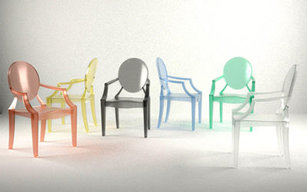
The Louis Ghost – Chair by Phillippe Starck (2002)

This modern take on the classic Louis XV chair is a fabulous addition to any interior.
This chair can be used in so many different ways; it can be used as a dining chair, or as an accent chair in a living room or bedroom. Below is a photo of the ghost chair as a seat for a make-up table. The options are endless, as are the colours! The Ghost Chair is a fantastic neutral, which makes decorating with colour and pattern much easier (and more fun!). They also come in kids sizes as well. Try this chair against a wall with a bold wallpaper, or with a patterned throw pillow!


The Panton Chair – by Verner Panton (1960)

Verner Panton’s stacking chair was the first single-material and single-form chair to be made.
It is a timeless chair and striking sculptural piece that is used frequently in modern interior design. It is a durable, statement chair that comes in many colours and complements a variety of different décor. This chair is incredibly low maintenance. The Panton chair can be used in a bedroom at a makeup table, or in a dining room! This chair would make a fantastic addition to any contemporary room and can be used in many ways.


The Egg Chair – by Arne Jacobsen (1958)


This Scandinavian style chair originated in the 1950’s and is a staple in modern design. The Egg chair is a simple, yet colourful addition to any design. It is versatile enough to be placed in a variety of different décor. If you need a pop of colour in your home, this chair is comfortable and classic! Egg chair comes in many different colours and can be used in many different spaces including: a living room, bedroom or office space. (It’s also been seen in tons of movies!) This is another example of classic design standing the test of time; it will never go out of style!


The Barcelona Chair – by Ludwig Mies van der Rohe (1929)

The classic simplicity of the Barcelona chair is one of the many reasons that this is such a staple in interior decorating. The Barcelona chair has been around for decades and is still a super popular seller in many stores around the world. This chair is a great option for many different areas of your home. The clean lines and leather with chrome base make the Barcelona chair a go-to for modern and contemporary interior design but the sleek lines make it an option for many different décor styles. It also plays well with others! So don’t be afraid to mix and match this chair with your existing design!

 These modern chairs are classics and they add a cool factor to any space!


0 comment
Share:
farmhouse-kitchen-style

The farmhouse kitchen is a style that we are seeing a lot of and it’s a trend that doesn’t seem to be going away anytime soon.  I think the timeless nature and the warmth that a farmhouse kitchen offers are just two of the reasons why this style is sticking around.

It seems like we are getting back to basics when it comes to home renovations and design style.  We are turning back to ‘simpler times’ for inspiration and for the kitchen especially – it is the heart and soul of the home – so not only should it look beautiful but it should also be functional. 

If you are considering a farmhouse kitchen renovation in your home…

Here are the 8 essentials in a farmhouse kitchen: –

1.  A generous sized island

So practical for serving and for prepping.  Stock the island with an over sized sink, dishwasher, microwave shelving ,open or glass shelving and don’t forget seating.   The kitchen island is always the ‘hang out’ in the space so going bigger is something you will not regret. 


2.  Storage. 

If you have some odd corners consider custom cabinetry for more storage, these spaces are perfect for storing entertaining essentials like extra stemware, table linens and stoneware.  You can customize these pieces to look like old farmhouse style freestanding furniture with upper glass panel doors with mullions and long drawers.


3.  A Warm Colour Palette. 

When we think of southern living and farm tables we think warm and welcoming.  So make the colour palette warm – you can still use darker tones but aim for subtle contrast as high contrast in this style of kitchen is a bit harsh. You can still opt for white as well but be sure to add warmth through choice of materials and other accessories, stay away from really high gloss finishes for instance.

4.  Simple Cabinetry. 

Shaker style, bead board details and v-groove give enough detail but stay true to the ‘simpler time’ look.  The farmhouse kitchen is usually a large one so a lot of detail can look too busy in the space. 


5.  A functional layout. 

In this style of kitchen, the placement of everything is straightforward so that it all works in harmony.  Even though a kitchen is large you still do not want any wasted space, always consider the work triangle.


6.  Symmetry

The cabinets, pendants and counter top configuration from one side of the kitchen to the other need to be as close to exact matches as possible.  Oh course, there will be some different elements (like what is actually on the counter top) but keep size, scale and balance in mind.  The eye is naturally attracted to symmetry, so trust yourself if you feel like something is off balance.


7.  Paneled Appliances. 

Remember a ‘simpler time’ is key.  So you can still have multiple (Big family? Consider two dishwashers and two ovens – BTW that’s my dream! ) and/or sized appliances but consider paneling the refrigerator and other appliances like the dishwasher in panels that match the cabinetry – it gives a seamless look in the kitchen


8.  Hardwood floors. 

Hardwood in the kitchen is such a warm look, the stain and the natural material brings the farmhouse into the kitchen, the wider the plank the more authentic it will look.  Other great options, if you love the look of natural wood – butcher block counter top on the island or barn beam legs for the island.


Remember, if this farmhouse kitchen is just too country or too southern living for you – you can always take elements of the style and make them more modern.  An over sized island with imple cabinetry in bright white or a pop of bright colour and a smooth and uniform caeserstone counter top is fabulous – add that country warmth with your accessories or backsplash even!  You don’t have to go full-country take the pieces that you like and blend the styles together.

The farmhouse kitchen style blends well with a touch of glamour (this adding some sparkle with some simple pendants with crystal detail) but it also works well with an industrial look too (add a reclaimed brick or wood wall and some industrial lighting). You can do a lot with the farmhouse kitchen and not be stuck with an overall country look.

Or, a functional layout and symmetry work for all styles of kitchens.  And customizing odd areas of your home with storage options is always practical.

You can always work with the basics and put your own spin on it!


0 comment
Share:
selling-your-home-top-9-upgrades-for

When it comes to selling your home some upgrades are just not worth it in the end. We have been staging home for a while now and we love to meet with home sellers before they start any updates.  There are updates that are worth the expense – and some that aren’t. 


Your real estate agent can be a big help with understanding your competition and also the clientele moving into your area.  A home stager can help you with the presentation and the updates – we love to let home sellers in on what buyers are looking for and also the look that they are attracted to. If you are thinking of selling your home in the near future, take a look at these tips for improving the appeal of your home to buyers. 

Some upgrades just aren’t worth it, but for some there are huge benefits for you, the seller.


1.  The kitchen. 

Buyers are willing to pay more or at least asking price if the home is ‘up to date’.  the kitchen is the heart of the home and sellers will get their money back if they spend it right in the kitchen.  Even if you cannot totally gut it and put in an entirely new kitchen, you should put in certain upgrades like a stone counter top, hardwood or porcelain tiles on the floor, stainless steel appliances, and islands attract buyers.  A home with a current kitchen will get a lot of attention from buyers!


2.  Hardwood floors. 

Especially on the main floor, and if you already have hardwood check on the condition they may need a sanding or screening with a new stain or seal.  And if they are in really poor shape, replace them with hardwood.  Hardwood is popular with everyone – it looks great, it works with any style of decor, it’s easy to clean and it also works for anyone with allergies. Hardwood too expensive? Check out the laminate alternatives at your local hardware store.  You might be surprised to see how amazing the new ‘hardwood’ laminate looks – plus it wears really well so it’s perfect for busy households and pets!


3.  Master ensuite. 

If you have an ensuite and not all homes do, especially if they are in older neighbourhoods, be sure to have it updated.  If you can’t afford a full renovation job – try updating the fixtures from brass to chrome,a new low flow toilet, a new paint colour, new towel and toilet paper bars, and rain shower heads in the shower are easy fixes. If you don’t have an ensuite but you have a large master bedroom, look into using some of the bedroom and turning that into an ensuite even if it is a bit smaller – buyers are looking for ensuites.


4.  Upgraded lighting. 

New lighting can completely transform a space and make it look more current. Pot lights, pendants in the kitchen and contemporary track lights can make any space look brighter and more chic. A chandelier in the eat-in kitchen and / or dining room can add an instant impact.


5.  Landscaping. 

Don’t forget your exterior – it’s the first thing buyers (and their realtor) will see.  Keep the gardens maintained, grass cut and trees/shrubs pruned. Remove the weeds and add some mulch to really make the flower beds look manicured. Flower pots and boxes at the front entry add some colour and a welcoming feeling.


6.  Finished basements. 

Aren’t just a must with families.  A lot of couples buying their first place want a finished basement for various reasons – office, workout space, man cave etc…Try and make the basement look as livable as possible.  Paint, carpet, windows and lighting make a huge difference.  Keep it light and bright down there.  Ceiling height in the basement is very important so be sure to have a space that is high enough.


7.  Bathrooms. 

Like kitchens, no one wants to pay top dollar for a home that needs major improvements and bathrooms are a hot spot in the home.  If you can’t afford a complete ‘do over’ in the bathroom, look at adding new lighting, paint, shower heads etc…in the other bathrooms too. 


8.  Paint. 

You will get your money’s worth and more with a new paint job. In a home that has smokers this is a MUST.  Stick to neutral tones throughout the home – you don’t know what the buyer’s personal style will be. A fresh coat of paint does wonders – it’s an instant facelift making the home looks cleaner, bigger and brighter!


9.  Basic repairs. 

Not really an upgrade but important.  Leaky faucets, cracked tiles, unfinished projects in the home should be fixed before buyers enter your home.  It sends the message that this home was and is cared for and loved.  It makes buyers feel reassured and confident.


It’s really best to tackle these ‘to-do’s’ before hitting the market.  buyers notice these details and if the little things are not dealt with now this could mean your house sits on the market and /or your price keeps dropping…

0 comment
Share:
stand-out-from-crowd-in-spring-selling

So Spring is almost here!  Youpeee!  So is the Spring Real Estate market! So are you thinking of selling your home?  Well, if you are one big factor you need to take into consideration is that there will be a lot of competition in the spring market. 

Why the spring? 

Well, the sun is out, the snow is gone (or at least on it’s way out), the grass maybe out and so might the flowers.  Generally our homes show much better too. 


So why do you need to stand out? 

Because there is so much out there, buyers have a huge selection and after a while the homes can all start to look the same.

So how can you stand out from the others? 

Try home staging.  Staging is a way to show your home in the best possible way.  Staging is best if it is done by a professional – they know what they are doing, they have experience, they work with Realtors and know what buyers are looking for but they are also an objective eye, they don’t take things personally.  you want someone who can highlight the features of your home, make it attractive for your target buyers and make it look incredible in photos, open houses and showings.


Realtors know that a properly staged home will sell faster and for more money.  Why is that?

Because any property that shows well will get a lot of showing requests, the more buyers through a home will likely results in quick offers and/or multiple offers.  when you are in a multiple offer situation, as a seller this means you will likely get above asking.


Some stats to consider:

“98% of the houses staged have sold over the asking price.”  HGTV’s Designed to Sell


“87% of people said that home presentation makes a difference in most sales.”  AOL Money and Finance Poll


“Homes that sold after four weeks on the market sold for 6% less than ones within the first four weeks!”  Survey by the National Association of Realtors


“Buyers willing to spend the money for an ‘ideal’ home, but not the time to renovate. The poll showed that 63 per cent of buyers preferred a higher priced home that does not require any renovations over a lower priced fixer-upper.”  Maritz Research Staging Polls


“Elements that create 72% of the first impression inside the home are within the control of the seller – well–trained staging consultants know how to show these to their best advantage.”  1999 Proctor & Gamble Survey


So what can you do to present your home in the best light?

– Start by decluttering the main areas like the bedrooms, kitchen, bathrooms, finished basement etc…Don’t worry about spaces like the garage.


– Give the entire home a top to bottom good cleaning think about getting a professional cleaning for the rugs

– Pay attention to the details like cracked tiles, leaky faucets, touch up paint and this is where an objective eye really helps, we get so used to living in our own space that we overlook all of the little creaks and cracks that a buyer would see.

– Remove the personalize items like family photos and collectibles, you’ll be taking those with you to your next place so think of it as pre-packing

– Updates, you don’t need piles of money to make your home look and feel current, small fixes like replacing old brass or plastic knobs and handles with chrome will really make any space feel more current.  Updating light fixtures and removing wallpaper boarders can make a huge difference.  Adding or updating a dated kitchen backsplash can also make a big difference!


– Think about getting a fresh paint job in the home.  On a tight budget? Paint the rooms that really need it


– Other add-ons, try adding some fresh colour with flowers, or a fruit bowl, or some throw pillows on sofas and beds.

– Make sure the home is well lit, pull back the drapes and let the light in and make sure the light bulbs are all working (replace the burn out ones).  If you have any dark corners in important rooms try adding a floor lamp.


Selling your home can be very stressful but if it is presented in the right way, you shouldn’t be on the market long….happy selling and happy spring staging!


0 comment
Share:
home-staging-mistakes

Take a look at these 8 home staging mistakes home owners make before putting their homes on the market.

A staged home spends less time on the market so take this advice and although some tips may seem expensive or time consuming, it won’t be too long and it will be worth your while.


8 Home staging mistakes (to avoid):


1 –Just because you love it does not mean that everyone else will too.

Ensure your property appeals to a broad market of buyers. In other words, keep it neutral, a bright colour reflects your personality and style which can be too much for buyers to get past.

This room looks great but the dark paint colour on the wall is a bit personalize and may turn off some buyers.  If thiese walls were painted in a lighter and neutral tone the room would look bigger and brighter.

2 –Edit your storage places too.

Buyers will poke around, opening kitchen and bathroom cabinets and closets spaces too. Be sure to spend some time organizing those area too. A cramped spaces sends the message to buyers that there is a lack of storage.

This room doesn’t present well.  It would be very challenging for buyers to see past this mess.  even though the furniture doesn’t come with the house – this much clutter says to buyers that there isn’t enough space.  Be sure to clean, declutter and organize!


3 –Scale and size of furniture.

Be sure that items such as furniture, plants and other decor pieces are in proportion with the room. You are selling the house (the space) not the items in it. Even if the rooms look somewhat empty, that is way better than over stuffed rooms. Story your larger pieces in a temporary storage locker or ask friends and family if they have some storage space you could borrow.

You need to make sure that a room has good flow.  The buyers (during the showings) need to be able to walk around freely without obstacles.  There is a lot of furniture is this room and although very attractive it’s too much for when you are selling your home.  

4 — Clean, clean, clean.

I know this means something different to everyone so keep your self and your home on a regular cleaning schedule – if you have to contact a professional to help you out – do it, it will be worth the extra cost. Be sure your home is in ‘showing condition’ at all times. You may receive a call from your realtor about a showing while you are at work and your dishes from breakfast are still in the sink – that leaves a very bad impression.

You really need to be on top of your house work while you are selling.  No one wants to come to view a property with dirty rooms, dishes all over the place etc…This leaves a really bad first impression.

5 — Your pet may be your best friends but he isn’t every one’s.

Some buyers are immediately turned off by any signs of animals in a home so keep pet hair to a minimum by vacuuming everyday, crating your furry friends or keeping them outside of the home while it is up for sale. When we were selling our home a few years ago, I went as far as paying my younger brother to “babysit” them during my open house.

6 — Pay attention to the details.

Don’t hide your flaws , either repair them before you go on market or have your price reflect that there is some work to be done. It is tough for a realtor to justify selling a house for top dollar when it is not in top condition.

7 — Upgrade periodically.

Change up your light fixtures, hardware, taps, faucets and drapery. You will likely get a better reaction from buyers plus it shows that the house has been maintained and cared for. Plus buyers are willing to pay more for a property that has already been updated.  Not sure where to update or what to do? This is where your real estate agent and home stager can really come into play.

A new light fixture can make a huge difference in a house.  It gives the whole home a fresh feel and look – opt for a style that is transitional (that means it works with different decor styles and this way this will work for most people).

8 — Don’t rush.

Get your house on the market once it is ready. Meaning get the little jobs done, listen to your realtor and home stager to help you get top dollar, an incomplete house is exactly that and buyers will not respond in a positive way. So take that time to finish up incomplete projects or tackle the to-do list from your stager – painting and small repairs can set up apart. Any time of year is a good time to sell, but when there is a lot of competition on the market (such as the spring season) you must be in peak performance.

Consider a fresh paint job in the home in a neutral tone, this instantly gives the whole home a fresh new feel and it looks clean and bright!

Selling can feel personal but it isn’t – you need to now think of your house as a product that is up for sale.  Like a product in a store you want it to sell so put the time in to make it a product that a buyer will want! Be sure to avoid these home staging mistakes,

0 comment
Share:
worst-upgrades-for-resale-of-your-home

When it comes to selling your home there are some updates that are ‘money makers’ and there are others that are just a waste of money. You really want to spend your money on upgrades that not only look good but ones that will pay off!

Here are the 10 worst upgrades for selling your home.


.

1.  Wall-to-wall carpet. 

If you are replacing your carpet flooring before you sell, hardwood is a must.  That is what buyers are looking for.  Carpet just doesn’t work for anyone with pets or allergies plus it’s tough to give it a quick clean.  If you have hardwood now, take a close look at it – does it need any repairs? refinishing?


2.  Whirlpool baths, indoor hot tubs and saunas. 

Once upon a time they were considered desirable but now many buyers find them passe and are afraid of what extra costs will be involved.


3.  Colourful bath fixtures. 

If you are updating the toilets, sinks and tubs in your bathrooms to get ready for sale (even if it is years away), keep the fixtures white – not almond, grey, pink etc…White is neutral and clean so it will appeal to everyone.


4.  Ornate chandeliers, wall paper, textured walls and bold paint colours. 

No.  Do not do this.  Keep it simple.  Stick with neutral paint colours.  Wall paper is just seen as a big removal project, textured walls were once a big trend but he trend is over and as for big splashy chandeliers – that’s a personal touch that should go with you when you move, so just put in a simple chandelier for the potential new owners.


5.  Expensive sound systems and home theaters. 

If you are doing updates for your home as you start to prepare it for sale, do not spend you money on this, it might attract some buyers but most audio/film buffs would rather just install this themselves. If you have a large basement that would really suit a home theater this is something your real estate agent could mention at open houses and showings.

6.  Vinyl Floors

Although it has come a long way in terms of style and it is practical for pets, kids, allergies and easy cleaning – it isn’t a feature that buyers like.  For only a bit more money, opt for ceramic, or hardwood. The new laminate floor that look like hardwood are a good option but at a certain price point, buyers expect to see hardwood so discuss that with your real estate agent.


7.  Removing bedrooms, turning a three bedroom into a two bedroom home. 

Even if one or two bedrooms are on the small side – do not eliminate one.  Fewer bedrooms means you will likely get less money on the resale market.  Plus anyone looking for a three bedroom will not see a two bedroom home.  Two bedroom condo apartments are popular but not two bedroom homes. Same goes for 4 bedroom homes – many families are looking for 4 bedrooms so don’t get rid of a bedroom.

8.  Swimming pools. 

There is a lot of discussion among Realtors about pools.  Buyers often love them or hate them – so if you have a big yard that would fit a pool, let your realtorpitch’ that idea a open houses and showings. It’s not an upgrade worth putting in. If you have a pool – make sure it is clean, maintained and functioning.  Buyers will want to know about additional costs so be sure to have that data available.


9.  Appliance upgrades. 

Stainless steel is certainly the ‘colour’ of choice for buyers but don’t get crazy with professional grade appliances it’s really not necessary.  Plus built-in espresso machines are seen as a concern if they breakdown and wine fridges are a personal item (not everyone drinks wine).

10.  Odd rooms. 

If you are in an older home you probably have some attic space or neat little nook under the stares – do not spend the time, money or effort trying to convert these funky little spots into a room or bathroom.  Show your realtor these spaces and he/she will simply call them ‘storage’ which IS something buyers are all looking for.


This mistakes can be costly so be sure to talk with your realtor before making any huge mistakes….


0 comment
Share:
110111213