Browsing Tag

kitchen ideas

5-tricks-for-helping-your-older-kitchen-fit-modern-times

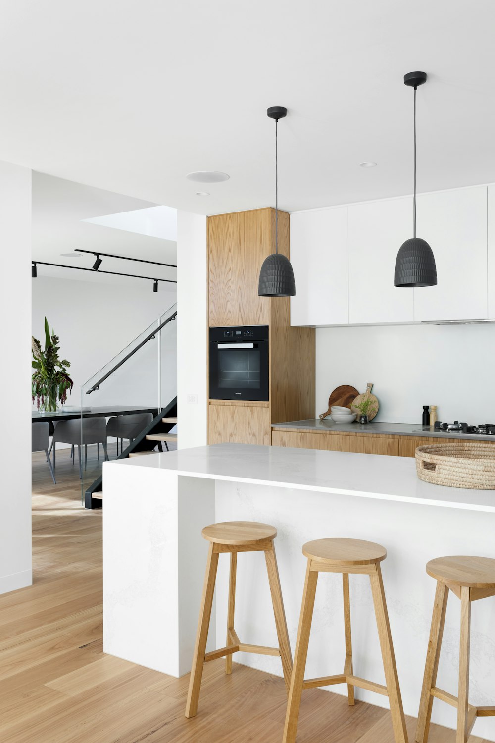
The kitchen is often referred to as the heart of the home. If your space is lacking in design and function, know you are not alone. An older kitchen with outdated design is a common complaint among homeowners. Look no further to learn our top five tricks for helping your older kitchen fit in with modern times.

Thinking about doing some upgrades to sell your home in the spring market? Learn exactly how to sell your property to get top dollar and understand the importance of hiring a real estate professional to help guide your sale.

Cabinet Refresh

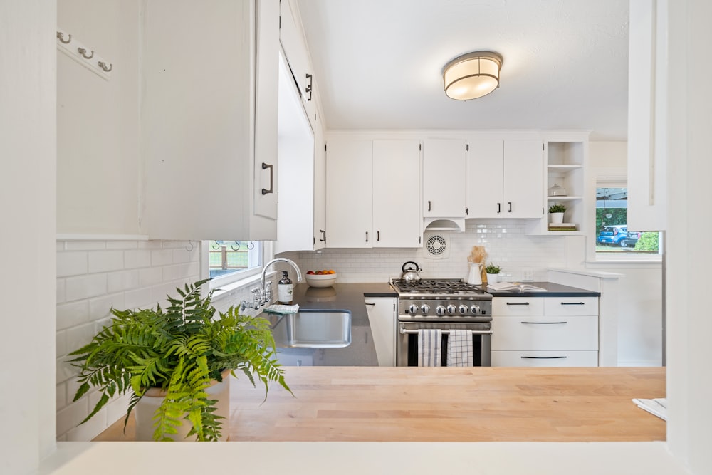
A commonplace that makes an older kitchen feel outdated is the cabinets. Giving your existing cabinets a refresh with a coat of paint can make your kitchen feel modern and clean. Those ultra-warm oak tones of the 90s are plaguing your space giving an outdated appeal. Instead, dive into endless color options for playful and modern design.

Consider selecting a rich tone for your lowers, and a bright and clean shade for the upper cabinets. Or go for a clean and crisp white or light gray all over for an airy look to your space.

You can either hire a professional to paint your cabinets or do it yourself to save some money. Know that if you decide to tackle the project on your own it’s best to do some research and understand that it is not a one-day job.
Metal Upgrade

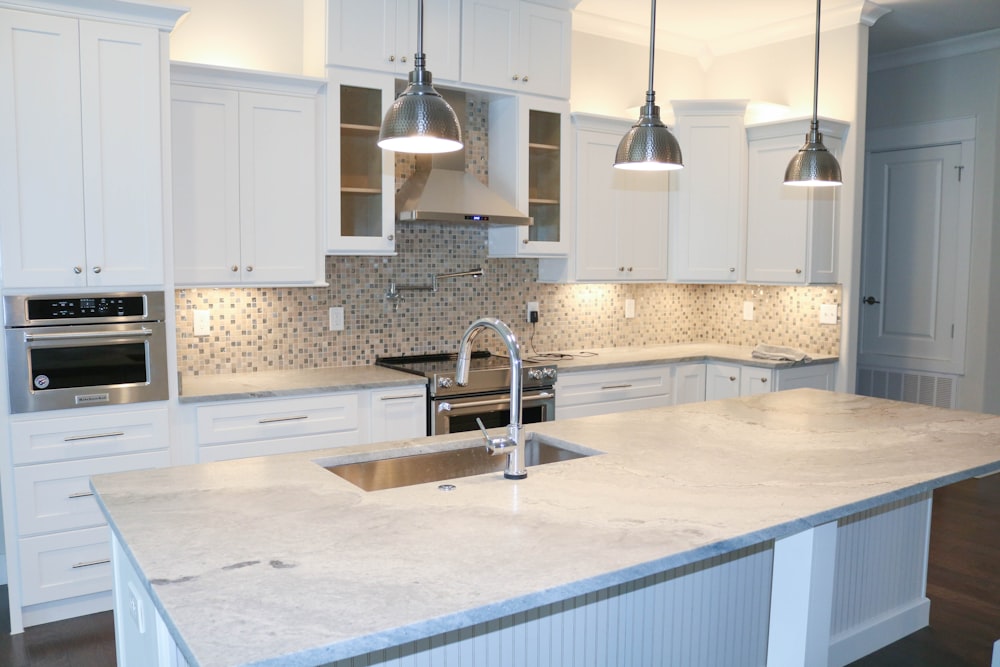
Cabinet hardware and kitchen fixtures are like the jewellery to your space. These finishing touches may seem like they don’t matter, but they can make a big impact. If you’re stuck with an old outdated finish, or builder-grade cabinet pulls, give them a modern upgrade to bring your older kitchen into today’s times. 

Get creative by mixing metals (maybe consider combining edgy black with timeless brass) for added interest and a high-end design. When selecting your hardware, go for something that is beautiful, but also functional. 

Countertops Matter

A large piece of your kitchen real estate is your countertops. If yours are looking dull and outdated, consider investing in some new ones. If you can’t afford real stone countertops, think about looking into man-made stones or engineered stones. If your space is on the smaller side, you can also ask about purchasing a remanent of a slab for a lower cost. 

If these options are out of your budget, know that Formica countertops have come a long way in the last 30 years. They can give you the look you crave at a fraction of the cost.
Splash of Modern

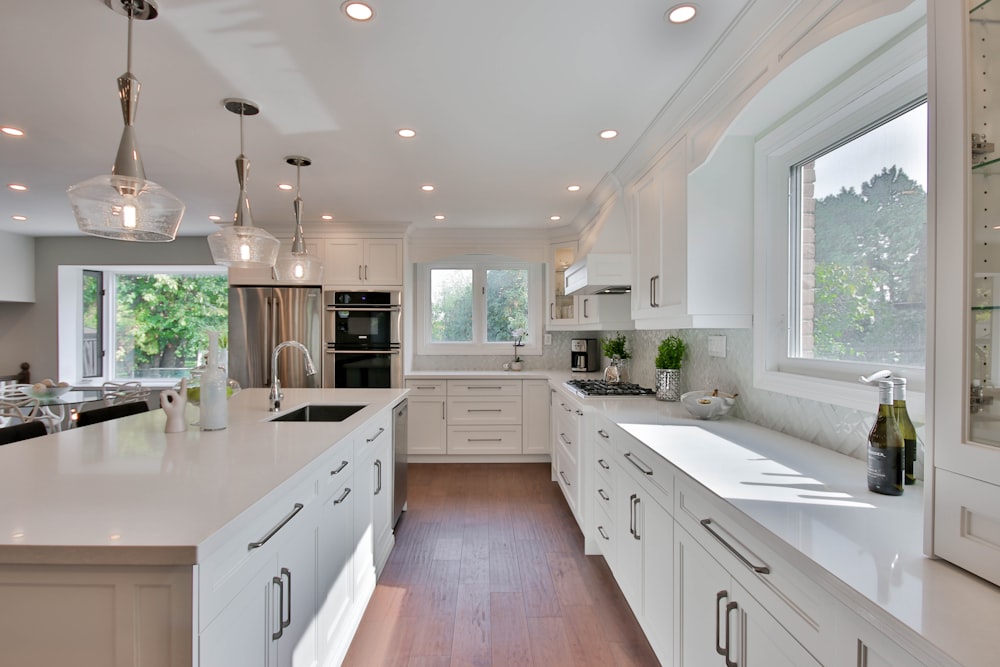
Another way to upgrade your outdated kitchen is to install a backsplash. Selecting a fun, modern tile can make a big impact on your space. If this is too pricey for your liking, consider using a peel-and-stick version to give the look you’re after at a much more reasonable cost. 

Let There Be Light

Our final tip on updating your kitchen space is to upgrade your lighting. This can be as simple as swapping out your existing fixtures, or hiring a professional to add recessed can lighting for a bright, cheerful finish to your space. Consider adding under-cabinet lights for a moody feel in the evenings, and bright light on your countertops while cooking. Lighting can instantly make a space feel more modern.

0 comment
Share:
how-to-do-a-diy-renovation-of-your-kitchen-on-a-budget

There comes a point in every homeowner’s life when the kitchen starts to look a bit dated. If you are on a strict budget then you may feel like you just have to live with it since kitchen renovations can be so expensive. The problem is that a dated kitchen will eventually be one that is not very usable as things progressively get worse. 

There are ways to save money on renovations, including the kitchen. In fact, with the right strategies, you can update your kitchen for thousands less than you would expect to spend. Sometimes, a renovation can be a hybrid between an actual renovation and a makeover. Both can make the kitchen more functional. 

In this article, we will go over some of the ways you can save money doing a DIY renovation. 

The cabinets

There are two main things that should be changed in a kitchen renovation. The cabinets and the appliances. The appliances are an obvious one since old ones don’t work well and are not nearly as energy-efficient as new ones. Buying new appliances will essentially pay for themselves. 

However, new cabinets will transform the kitchen in many different ways. You can organize your kitchen to be more useful since you will improve its workflow. And it will also look updated and not like a retro throwback to an earlier time. 

RTA kitchen cabinets are the best choice since they are ready to assemble which makes them ideal for the DIYer. Even if you aren’t very handy, installing cabinets yourself is doable and will save a ton of money. 

The flooring

Putting in a beautiful hardwood floor can be very expensive. The materials cost a lot and it requires a professional since it is usually beyond the ability of most DIYers. However, you can have a beautiful-looking floor that replicates hardwood for a fraction of the price and easily install it yourself. 

There is what is called a floating floor or laminate flooring. These are basically planks with a cover on them to simulate hardwood but are actually laminated plywood. They are called floating floors because they are installed over the existing floor over a styrofoam blanket and actually can move around to a degree. 

They cost a fraction of a hardwood floor and can be installed easily in a day if you work in two. They click and lock on each other so there is nothing to assemble really. The only thing you need to do is cut them at their ends to fit against the wall with a gap so they can expand. 

Give it some paint

Once the cabinets and floors are done, a fresh paint job is going to seal the deal. The look of the kitchen can be tied together well with the right color scheme. It is what will update the look and bring it to modern times instead of looking like a blast from the past. 

Pick the colors that will work best with the color of the floor if you decided to go with a natural wood effect. 

FOR THE KITCHEN…

0 comment
Share:
essential-cooking-tools-every-kitchen-needs-to-have

Kitting out a kitchen is not the cheapest task around, as a kitchen requires so many essentials to be ideally functional. So, whether you’re a bachelor that’s just starting in your new home, or you’re battling to prepare most meals and dishes, be sure your kitchen has all these essentials. 

Once you have the essentials, you should look at investing in a few kitchen extras that will further enhance functionality. Appliances such as blenders and juicers are handy, and there are tons of other extras that you should also consider. 

Kitchen Knives And Suitable Storage

If you’re currently battling along with a few steak knives or regular kitchen blades, investing in a set of quality kitchen knives can make a massive difference to your culinary skills. 

And while you can purchase a set that will include all the essential knives, you can also buy them individually. The knives you’ll need include a paring knife, a chef’s knife, a serrated bread knife, a carving knife, shears, and a few others. 

And once you have purchased your essential knives, you should also invest in a knife block or a magnetic knife strip for proper storage. In addition, you’ll also need a steel rod and a whetstone to hone and sharpen your blades routinely. 

A Cutting Board

A cutting board is vital to keep your kitchen counters from becoming scratched and damaged over time; chopping, slicing, and dicing is not ideal to do directly on countertops.

And chopping boards are pretty affordable as well, so you should opt for a quality board that will last you a few years. 

Measuring Cups

Measuring cups are another essential you’ll need to follow recipes, whether cooking or baking. These generally come in sets, which is the easiest purchase option. That said, you should also consider a measuring jug and a digital kitchen scale to ensure you can always follow recipes properly. 

A Quality Pot Set

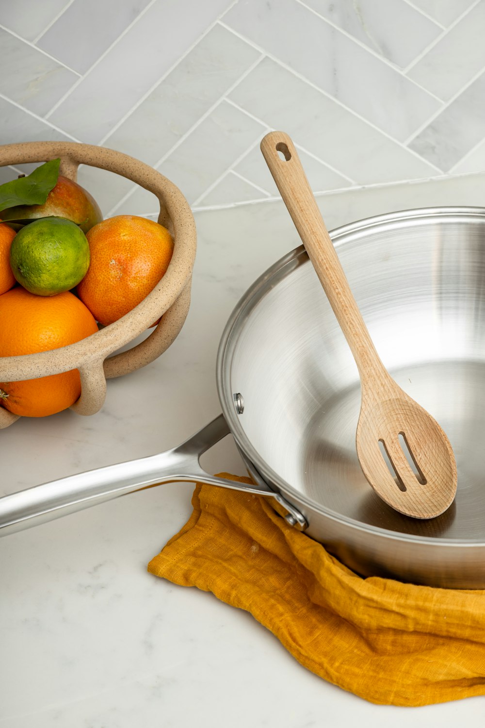
You won’t be able to cook or prepare anything without a pot set. And while there are pocket-friendly options, you should rather avoid these as some are made from inferior materials and won’t last long at all. In contrast, others are made from materials that can be harmful to your health. 

So, when shopping for pots and pans, you should consider which types you will need, the materials they are crafted from, and proper cleaning requirements. 

Crockery

You’ll also need cups, bowls, plates, and mugs in your kitchen. And these can also be purchased in sets. So, just one set is all you’ll probably need. You should also buy a set of drinking glasses.

Other Cooking Tools

A whisk, a potato masher, a spatula, a sieve, and a set of cooking spoons are also essentials that you will need for various uses around the kitchen. Once again, the easiest option is to purchase sets of these as you’ll get all you need in one simple purchase. 

The more cooking tools you have in your kitchen, the more functional it will become. And even though there are always cheaper options available, inferior quality cooking tools never last and often risk health concerns. So, instead, spend a bit extra on quality to ensure your kitchen things can last a lifetime. 

SHOP KITCHEN…

0 comment
Share:
how-to-give-your-kitchen-a-modern-look

The kitchen is said to be the most-used room in a home. Many of us gather there for chats, family meals, parties, and cooking, so it must be a room you like the look of and enjoy being in. If your kitchen is looking a bit tired and dated, here are some tips on how to give your kitchen a sleek, modern look. 

Paint it

Nothing cheers up and cleans up a room like a fresh lick of paint. You can paint the walls or, if you are really inspired, paint the kitchen units. The latest trend is to paint the wall cupboards a different color than the base units. Black or navy is very “now” and will give your kitchen an expensive, classy look, especially if you accessorize with gold or rose gold trinkets and utensils. If you don’t want to cast gloom on an already dark kitchen, opt for classic white paint. A white minimalist kitchen always looks clean, spacious, and modern.

Build It In

It is essential for a sleek-looking kitchen that all units are flush with the walls and with each other, and no furniture is sticking out beyond the clean lines. Opt for built-in appliances that are hidden behind doors or give them a built-in look by sealing off all spaces and gaps with gratings or panels. 

Change the Hardware

An inexpensive way to instantly update your kitchen is to replace old wooden cupboard handles with funky new ones. Hardware is available in many different colors and shapes, so look for something modern in polished chrome or even gold. If you can, create a super streamlined look by leaving your doors handleless and furnishing them with push-open fittings. A modern fridge-freezer with stainless steel trim will look like a futuristic machine as it sits snugly beside your units.

Upgrade Appliances

The design of kitchen appliances is continuously evolving. A modern kitchen needs modern devices, so rather than spending money on replacing units, invest in a quality built-in oven or free-standing modern range cooker. Stick to white or stainless steel goods as colored appliances can go out of fashion quickly. 

Accessories can make or break a look. Modern accessories will create a modern look. Clutter does not help create a sleek look, so clear all surfaces and keep worktop adornments to a minimum. Ensure you have plenty of storage in which to hide stuff away from sight. If you are lucky enough to have a walk-in larder or utility room, store small appliances and items you don’t use every day in there.

Accessorize your kitchen

Some geometric ceiling light fittings made from gold or copper wire will provide some color and interest to a monochrome kitchen. Framed abstract prints and wall art can personalize your space so that it isn’t too clinical looking.

Small kitchen appliances like kettles, toasters, and coffee machines are available in futuristic-looking designs, and they can look like works of art sitting on your kitchen worktops.

SHOP KITCHEN FAVORITES…

0 comment
Share:
5-factors-to-review-kitchen-renovation

When the time comes to upgrade your home, the kitchen is often the number one choice for most families. Most of us consider the kitchen the epicentre of any home. If your budget is limited and a complete renovation is not possible, you can still achieve outstanding results by updating a few specific features. However, having a generous outlook on your expenditure will pay off in the long run.

A kitchen renovation will Increase the Appeal and Value of your Home

There are numerous advantages to improving this key area of your home. The illusion of space can be amplified, you will be able to enjoy modern functional updates, and your productivity will increase. When planning the details of the renovation, you should also plan to update the appliances in the room, which improves functionality dramatically. The alluring project can also enhance aesthetics as even the smallest of changes can make a massive impact. Lastly, remodelling radically increases the value of your home, which will make it quicker and easier to sell.

Upgrade your Appliances

There will be times when appliances stop serving their purpose. One way to upgrade is by replacing appliances with modern and appealing models. You can purchase newer models of ovens, microwaves, and cookware. A review of Made In cookware will help you decide on the best cookware you can buy to upgrade the overall functionality.

Revamp your Cabinets

Cabinets are one of the first features to be upgraded as they are an obvious requirement. They are also the first thing to get stained or damaged. If you want to modernize your cabinets, you can start with the hinges, and latches, as this improves the look significantly. Some homeowners even go so far as installing self-closing cabinet mechanisms which prevent slamming and allow you to take whatever item you want out of the cabinet and walk away without worrying if you have left it open or not.

Sinks, Faucets and Hardware

Sinks, faucets, and hardware are the third most replaced elements. These elements are often upgraded together with counters. New fixtures and more efficient faucets can make anything from washing the dishes after dinner to cleaning vegetables for a salad more pleasant. Enhancing these factors can even make your home more environmentally friendly.

Wall Design

The fourth most common design option that will have a massive impact is the walls. Whether you choose flat paint, a unique painting technique, wallpaper, or paneling, the walls can affect the look and feel of the entire room by influencing the first impression your kitchen can offer. Simple paint is probably one of the most cost-effective ways to spruce up the look as well.

As a homeowner, you cannot start tearing down walls or any permanent fixtures in preparation of making significant changes until you have a budget. Your budget should detail all the relevant costs when doing a complete kitchen remodel. If your budget is somewhat restricting, the modifications as mentioned above will undoubtedly cost far less than a renovation. You can still make impactful changes that will make your kitchen stand out more than before and be the space that you envisioned it to be. The features mentioned above are worth considering and will give you the most flexibility in designing your new dream kitchen.

SHOP KITCHEN …

1 comment
Share:
white-shaker-style-kitchen-will-never

The white shaker style kitchen has been seen in kitchens for years! So is this style ever going out? It seems like very Pinterest board, very magazine and every home improvement show has the white shaker style kitchen.  So why is this style so popular?

The Shaker kitchen

Shaker style furniture is known for it’s simplicity and some may say ‘minimalist’ design.  The shaker design refers to the door style – it is a 5 piece door, with a recessed center.  The shaker style drawer could either be a flat panel (which we see in more modern style kitchens where detail is minimal) or you could see the 5 piece door in a drawer. 

This is an incredibly popular style because of it’s versatility but also it is so transitional depending on your handle choices for instance, you can make the cabinet suit any style of decor.

The White kitchen

Still the most popular choice for homeowners – they are clean, fresh and classic.  White works with all styles – you can easily add or incorporate elements of wood in flooring, counter tops or even some reclaimed wood accents.  You can mix your hardware style and finish.  Add glass cabinets and floating shelves, marble backsplash or subway…you can do so much with this colour of kitchen!

This is the best of both worlds – the simple design in white.  It’s perfect!  You can adopt this white shaker style kitchen to just about any style by adding the hardware and accents like back splash, lighting, faucets and more….

Here are some of our favourite examples of amazing white shaker style kitchens:

This white shaker style kitchen is perfection – the mix of the apron sink with the goose neck faucet, the herringbone marble tile backsplash and the oversized stainless steel pulls – makes this white kitchen anything but boring!

This white shaker style kitchen has a bit of a classic meets vintage quality.  The mix of the pulls and knobs in the antique black finish gives some depth and contrast.  The subway tile in the staggered formation with the dark grout looks vintage (like something you would find in a bistro). The open wood shelving add a decorative touch and keep the kitchen from looking traditional and the marble countertops add another classic element. 

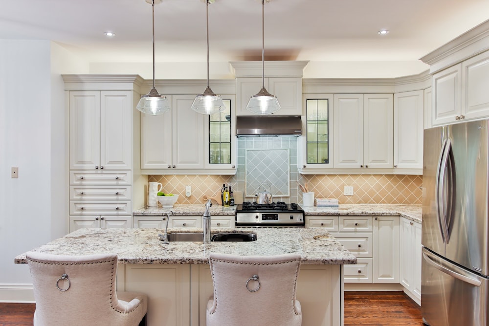
Keep it traditional and add an antique touch to the clean lines of a shaker cabinet by adding some crystal knobs and pulls – this adds a great ‘bring’ factor, too! The white subway tile, the white quartz counter and the glass cabinets keep it classy in this all white kitchen.  The cabinetry style is the perfect back drop for all the more detailed elements!

Yes, brass is making a comeback – some of you are cringing….but it looks so fresh in the all white kitchen!  We love the mix of knobs and pulls – it’s a designer look and it really ups the look of the entire kitchen.  The brass adds great visual impact but also a warmth in this all white kitchen, as does the wood floor.  A simple kitchen cabinet can really stand out with great details.

So why do we think this white shaker style kitchen will never be out?

Because classics are never out of style.  They may fade in popularity but they never fade away. 

So if you are considering a kitchen renovation don’t overlook this classic and transitional style – it is perfect in every way,

SHOP KITCHEN PIECES…

6 comments
Share:
kitchen-design-trends-2017

The kitchen is the heart of the home and whether you are a gourmet or not, you want your kitchen to look stunning! If a kitchen renovation is on your to-do list, take note of the hot kitchen design trends for 2017.

Grey in the Kitchen:

Although white is still a top choice for homeowners, grey is a close (very close 2nd).  We started seeing this trend about 3 years ago in the trade shows but now the grey kitchen cabinet is much more mainstream. If you are a bit hesitant, opt for a soft and warm grey tone for the kitchen cabinets. It’s still timeless and neutral but it’s a great alternative to white.

Farmhouse kitchen sink:

Also known as an apron sink.  This sink style has been around for a long time but it has really gained popularity with the whole revival of the ‘farmhouse look’ trend.  This style of sink comes in all sizes and configurations (single bowl, double bowl…) but it comes in other colours and materials.  Plus you don’t have to necessarily have the farmhouse look in your kitchen – you can have a clean contemporary style or an industrial style kitchen – it is a very transitional sink.

Tuxedo kitchen:

We are seeing a lot of tuxedo kitchens in 2017.  Not familiar with this term? A tuxedo kitchen is a kitchen with dark lower cabinets and kitchen island cabinets (in a black like a tuxedo but we are seeing lots of variations like navy, dark stained wood and charcoal grey) and white upper cabinets.  This adds some visual interest to a kitchen and in our opinion looks best in larger kitchens. 

Bold Kitchen Light Fixtures:

Statement lighting is everywhere and we mean in every room in the house and the kitchen is no exception.  We are seeing lots of larger and more interesting light fixtures in the kitchen – over the island, the eat-in area and in the kitchen itself.  There are so many styles of lighting – so there is something for everyone! Get creative with colour, size and shape – we love this classic lantern pendant in pink and gold – so unique!

Mixing kitchen counter tops:

We are seeing clients get more and more adventurous when it comes to making selections in the kitchen.  It can be tough to narrow down your selections – so don’t! Opt to have 2 different counter tops in your kitchen – 2 different stones, a stone one and concrete one, a stone and wood one….the combinations are endless.  This is a great way to really make your personality shine in your kitchen!

Navy in the kitchen:

Navy in the kitchen right now is where grey was about 3-4 years ago – just emerging – but we are seeing it more and more in magazines and TV shows, so it is only a matter of time until the navy kitchen is the new grey kitchen! We love it mixed with brass or gold hardware (which is also starting to catch on).  A navy kitchen looks incredible with just a simple shaker style door – because the colour is so deep and rich you really don’t need a lot of detail. 

Interesting Kitchen Backsplash:

For a while it was all about the glass tile mosaic back splash and then more recently the subway tile but now we are seeing all different shapes and colours – even patterned tiles! We are definitely seeing people take more ‘risks’ this year when it comes to tile.  Whether it is a herringbone layout, a hexagon shape or a pattern tile – back splashes are a lot more interesting this year! (We are seeing this trend in bathrooms, too)

What do you think of these kitchen design trends ?

23 comments
Share:
our-top-10-kitchen-islands

The kitchen island is almost an essential part of a kitchen these days.  We see them in kitchens of all sizes and styles.  They are so practical plus we love they way they look – they offer us storage options, serving and prepping space and even a dining area.

Here are some of our favourite kitchen islands:

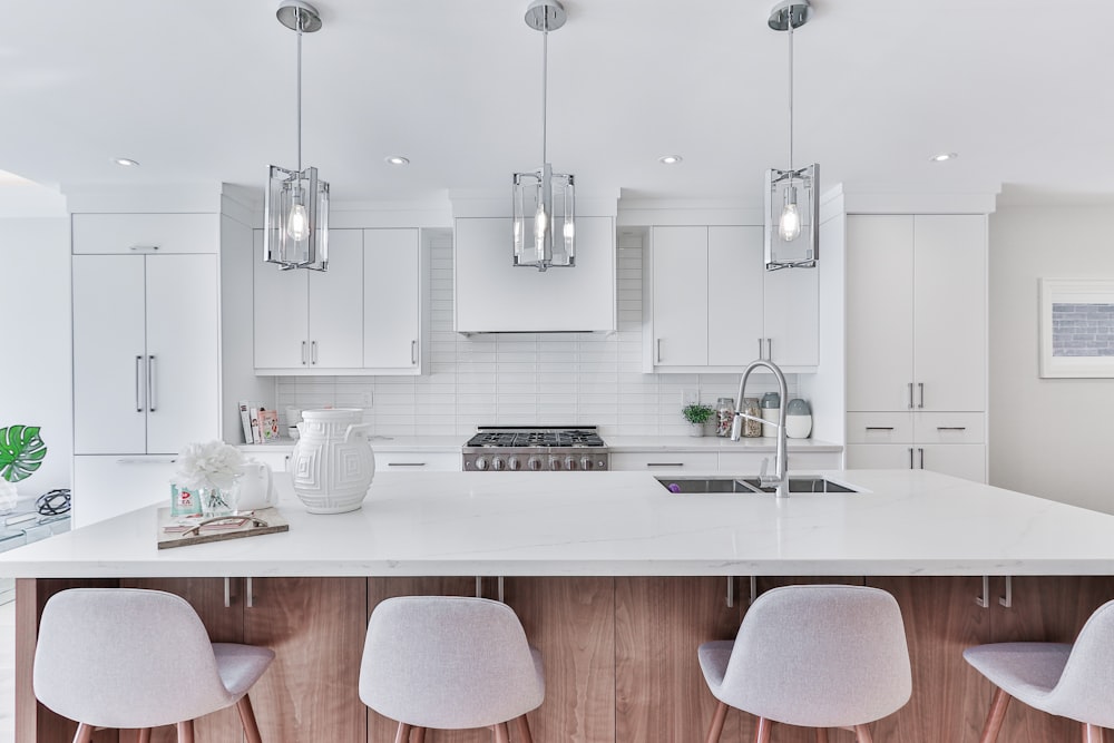
We love any over sized kitchen island – it is perfect for anyone who loves to cook and entertain.  This is also a beautiful piece  in this kitchen.  Look at the seating for 4 and those lantern pendants really make this island look and feel like a dining space.  The sink makes this island a great working area too. We love the storage and the serving space this island offers. This is a perfect addition to a dream kitchen!

Pot and pan drawers are a must in your kitchen island.  Look at all of this storage! This oversized island is almost a complete kitchen it’s self.  Storage for days, prep space, cooking space a sink and so much more.

Just because something serves a purpose doesn’t mean it can’t also look good! We love a pop of colour so why not add one to your kitchen? When your kitchen island is in a different stain or paint colour it really looks custom and it looks like a piece of furniture.  This island offers so much closed storage but it’s a great hang out with 2 stools at the end plus it’s just perfect for serving an prepping look at the over sized flat surface.

Looking to make a statement with your kitchen island? Think about going ‘live edge’. This live-edge walnut kitchen island counter top is a show stopper! It adds an organic element to this sleek and streamlined modern kitchen.  We love the wood grain and knots – so much character and uniqueness.

We love a butcher block kitchen island but how cute is this dog bowl feature? If you have dogs at home incorporate them into your decor and design.  These stainless steel bowls can be removed for easy cleaning but when in place they are out of the way with no risk of being knocked over and making a mess.

We love the rustic look of this farmhouse kitchen island.  The grey stain softens the look of the wood plus it works with the veining in the marble back splash.  The open shelving is very convenient when plating and we like the look of these clean, smooth white dishes (and white cabinets) with the rustic wood grain – we love the mix of textures.  This island has so much character!

We love this ‘beverage station’ in this kitchen island – it’s perfect if you love to entertain! A wine rack, ice maker and beer/soda fridge in the island is such a great idea! Easy access and it won’t take up space in your main fridge.  With it tucked away in the island it won’t take away from the beauty of your kitchen.

We don’t see this often – but we love it!  A round kitchen island : this is perfect for a smaller kitchen -the circular shape really softens up the look in a kitchen and appears to not take up as much space; a circular shape offers great flow (that’s why a circular table is often a great choice for a small space). This still has great storage a surface space.  We also love the soft tones in this kitchen – the cream, taupe and wood – timeless with a bit of a country feel.

This island has it all –  seating, storage, open shelving, surface space and a stove top.  this modern sleek look kitchen island offers so much for this kitchen design. We love the mix of black, wood and grey waterfall quartz counter top.  The pendant lighting is beautiful and we love how the hood fan is built in so it doesn’t visually block in the kitchen and obstruct the view.

Take some inspiration from this kitchen with a commercial restaurant design.  This T-shaped island is perfect for parties – so much space for prepping, serving and let your guests watch while you create! the mix of stainless steel and wood grain is a great balance of modern and organic, warm and cool.  So clean and streamlined in every way.

Which kitchen island is your favourite?

0 comment
Share:
we-answer-wednesday-kitchen-backsplas

“I moved into my townhouse a year ago.  I love my kitchen!  it’s white with light grey counter top and grey tile floor.  This summer I want to add a back splash but I’m not sure what to choose.  Any advice?”

A white kitchen is classic and a great choice for a smaller space.  It’s light and bright and in terms of resale, it has mass appeal. Adding a backsplash is a simple update that isn’t disruptive to your life at home. A backsplash in a kitchen is like adding jewelry to an outfit – it really pulls it all together.  This year in tile it was all about shape, the colours were all neutral but the shapes were the focus.

For a back splash, you have lots of options.

Subway tile –

this is a classic and you cannot go wrong with this option.  Seen here in a brick or staggered formation it mimics the look of brick.  A typical subway tile is 3″ x 6″ but there are variations in size.  In terms of colour – a soft grey is a good neutral option as is white but you could also go with a charcoal for a more dramatic look.  If you are thinking you might sell in about 3-5 years choose something with some longevity like a neutral tone.

Stainless Steel Tile –

this has a bit more of an industrial edge.  This material works well in a kitchen as it’s easy to clean and maintain.  You will also have a lot of shapes and sizes to choose from.  This also looks great in a kitchen that has stainless steel appliances.

Glass mosaic tile –

this option was super popular a few years ago.  This is still seen today but more tone on tone like the image here.  Various shades of grey and a mix of clear and frosted glass.  Again, a soft look with a bit of texture and shine – ideal for a smaller kitchen.

Marble tile –

Marble is so classic and elegant but we have been seeing it in more modern and contemporary spaces, too.  It is a material that requires a lot of maintenance when installed as a counter top but as a back splash not to so much.  The natural variation and veins make it visually interesting and it look amazing when paired with grey and white.


Hexagon tile –

a popular shape in 2015 for backsplashes and floors.  Try this in a neutral tone and it will give even the most ‘tired’ kitchen a fresh look.  The shape is interesting  but not over the top.  Hexagon tiles also look incredible in bathrooms too, in a shower as an accent or on the shower floor.


Herringbone formation –

still looking for something a bit different but not totally off the wall? Try a herringbone formation.  Using a subway tile, instead of staggering the tile you lay it in a ‘zig zag’ format.  Herringbone is a pattern we often see in menswear but we are seeing it in tiles.  Stick with a neutral colour palette and a grout that is a few shades lighter (or darker) than the tile so that the pattern shows.  This also looks great on a floor with a 12 x 24 tile.

Arabesque tile –

this is a shape that’s recently popular.  It adds an elegant touch to a kitchen.  Again, use a grout with some pigmentation so that the shape is evident.  It’s lovely in white and soft grey.

Kitchen back splash tiles are that final touch that really pull it all together!

0 comment
Share:
what-to-do-with-that-awkward-space

In some kitchens you will notice that there is an awkward open space between the ceiling and the top of the kitchen cabinets. Other than building in a bulkhead to meet the top of the cabinets – what can you do?


Depending on your style or your situation this can be usable space.  It can be used for storage or decor, ideally both.


If you are selling, we strongly suggest not displaying it as cluttered storage packed with various things like large Tupperware, platters and small appliances -as that sends out a message to buyers – this kitchen doesn’t have enough storage (which is a negative)!!


If you are selling and staging, try painting that open space.  We recommend the same tone as the cabinets (or at least something light that works with the palette or the same wall colour as you have in the kitchen already)  That will keep an open feel in the kitchen- a bright or dark paint tone will draw attention to the awkward space and give an odd striped effect


Ideas if you are staging:


This kitchen shows a lighter tone that works with the colour palette


This image shows a kitchen where the gap is painted in the same tone as the cabinets you can see how the awkward gap just disappears.


Clean and uniform storage….wicker baskets are a great way to add some natural material to your space – this looks great in a rustic or country style kitchen plus these baskets hide items that maybe are not suitable for display like cooking magazines. This would work for staging as it is clean looking and practical not cluttered and junky.


Decor for your everyday living there are some easy and interesting display ideas….


Try adding some cute and fun messages like Eat, Laugh, Family…..


Layer some decorative pieces but keep to a tight colour palette  – seen here there is a mix or shiny metallic and white – that gives a streamlined look


Photo from House Beautiful


What about wall paper? This works is you have some wall space covered in the same wall paper…


Take advantage of high ceilings by using the space to display bold pieces of art


Love that cafe look and feel? Bring it home with chalkboard paint and some fun messages, inspiring quotes, recipes and more….


Are you a collector or cookbooks? This could work for some great book storage but make sure to style the space so it doesn’t look cluttered


Get a little retro with some wire baskets that can hold practical items that will also add some pops of colour


Be unique – display a cool collection that symbolizes your passions – love to travel? Try this interesting yet simple display….


But no matter what you have up there be sure to dust it regularly as it can collect a lot of dust over time.

0 comment
Share:
12