Browsing Tag

kitchen tile

how-to-give-your-kitchen-a-modern-look

The kitchen is said to be the most-used room in a home. Many of us gather there for chats, family meals, parties, and cooking, so it must be a room you like the look of and enjoy being in. If your kitchen is looking a bit tired and dated, here are some tips on how to give your kitchen a sleek, modern look. 

Paint it

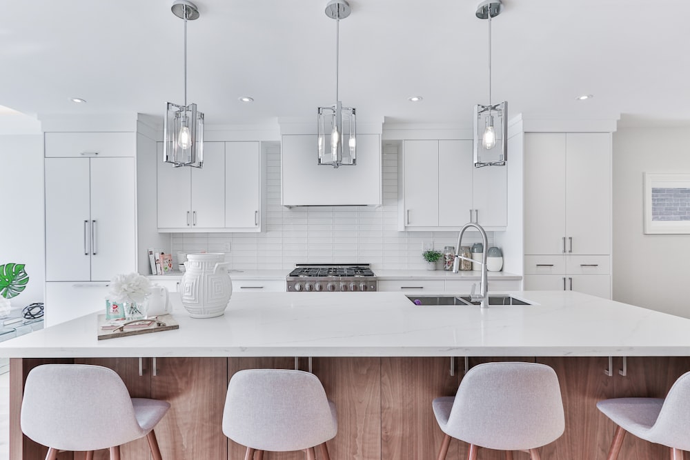
Nothing cheers up and cleans up a room like a fresh lick of paint. You can paint the walls or, if you are really inspired, paint the kitchen units. The latest trend is to paint the wall cupboards a different color than the base units. Black or navy is very “now” and will give your kitchen an expensive, classy look, especially if you accessorize with gold or rose gold trinkets and utensils. If you don’t want to cast gloom on an already dark kitchen, opt for classic white paint. A white minimalist kitchen always looks clean, spacious, and modern.
Build It In

It is essential for a sleek-looking kitchen that all units are flush with the walls and with each other, and no furniture is sticking out beyond the clean lines. Opt for built-in appliances that are hidden behind doors or give them a built-in look by sealing off all spaces and gaps with gratings or panels. 

Change the Hardware

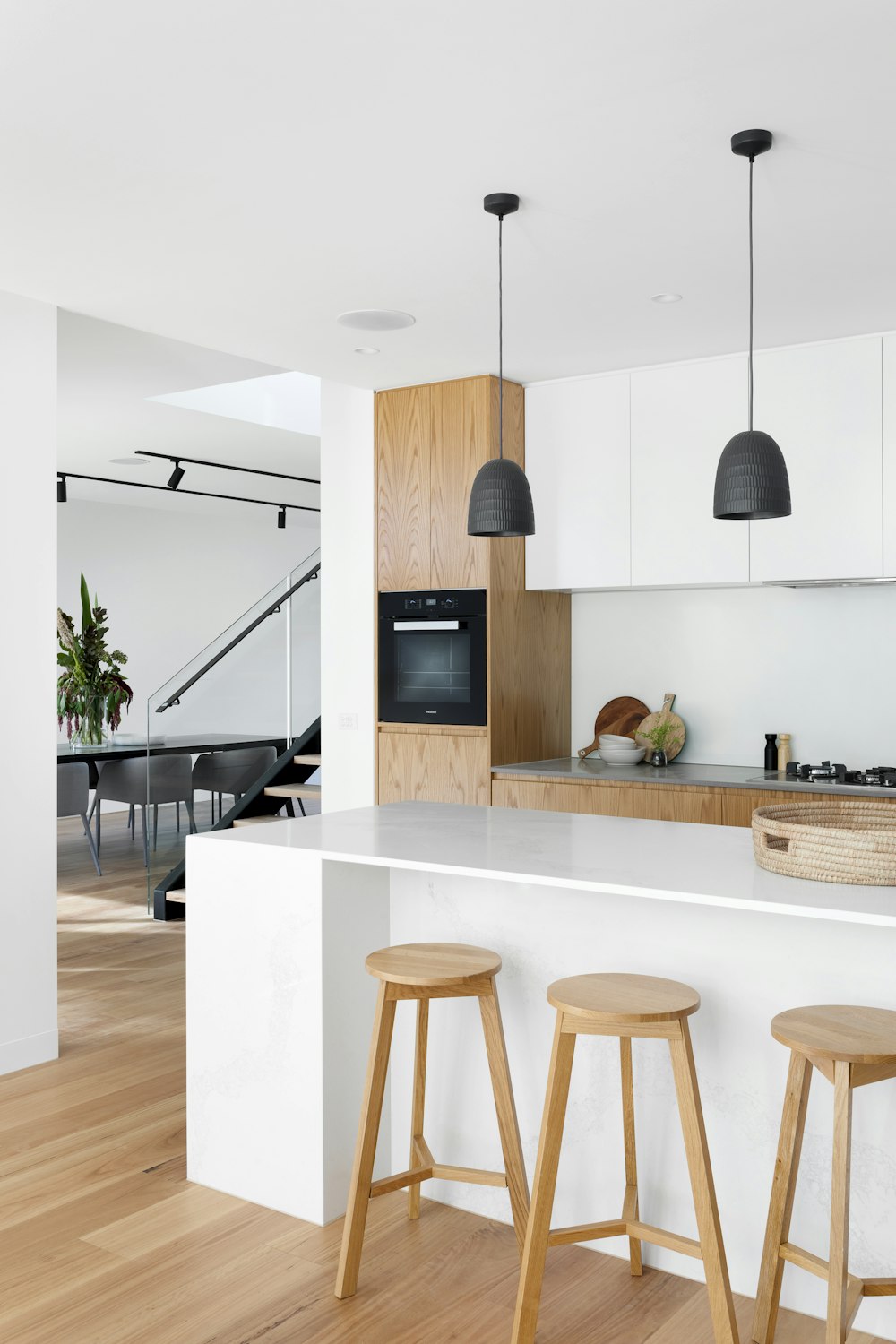
An inexpensive way to instantly update your kitchen is to replace old wooden cupboard handles with funky new ones. Hardware is available in many different colors and shapes, so look for something modern in polished chrome or even gold. If you can, create a super streamlined look by leaving your doors handleless and furnishing them with push-open fittings. A modern fridge-freezer with stainless steel trim will look like a futuristic machine as it sits snugly beside your units.
Upgrade Appliances

The design of kitchen appliances is continuously evolving. A modern kitchen needs modern devices, so rather than spending money on replacing units, invest in a quality built-in oven or free-standing modern range cooker. Stick to white or stainless steel goods as colored appliances can go out of fashion quickly. 

Accessories can make or break a look. Modern accessories will create a modern look. Clutter does not help create a sleek look, so clear all surfaces and keep worktop adornments to a minimum. Ensure you have plenty of storage in which to hide stuff away from sight. If you are lucky enough to have a walk-in larder or utility room, store small appliances and items you don’t use every day in there.

Accessorize your kitchen

Some geometric ceiling light fittings made from gold or copper wire will provide some color and interest to a monochrome kitchen. Framed abstract prints and wall art can personalize your space so that it isn’t too clinical looking.

Small kitchen appliances like kettles, toasters, and coffee machines are available in futuristic-looking designs, and they can look like works of art sitting on your kitchen worktops.

SHOP KITCHEN FAVORITES…

0 comment
Share:
how-to-use-pattern-tiles

 Pattern tile is everywhere these days! We started seeing them really emerge in the past 2 years or so.  They made a big splash at recent Design Shows, too!  They can really add a unique touch to a space.  Like the wallpaper accent trend they add some boldness or whimsy to a room but too much can just be overwhelming.

If you like the look of a print or pattern, how can you use the pattern tile in a way that won’t overwhelm or get ‘tired’ quickly.

1.  Use a pattern tile in a small space like a bathroom.

For a few reasons, it won’t be too overwhelming because the pattern isn’t everywhere and also, should you decide to change it in a few years or so it won’t be a huge undertaking. This image has the pattern tile on the floor in a neutral palette it is soft but still makes an impact.


2.  Stick with one pattern in the space.

When it comes to fashion mixing patterns is very chic but when it comes to pattern tile – to make the most impact stick with one pattern in the room (other wise it just gets too busy) keep the other pieces like cabinetry and paint pretty low key and solid. We love the backsplash tile here with the stainless hood fan and stove and against the white -Can you say?  #wowfactor

3.  Use it as an accent.

See a pattern tile you love but concerns that it might be a bit over the top? Treat it like the wallpaper accent wall – only tile one wall in the tile and keep the rest plain but complimentary. This blue pattern tile is busy and if the entire shower surround was covered in this tile it would be very overwhelming and likely not as pretty.  This accent tile makes a statement. A little pattern tile can go a long way

If pattern tile is still just a bit too much for you but you want something different, consider lay out and shape.

Take some inspiration from this kitchen back splash. Typically we see rectangular tiles in a stacked formation or brick but this herringbone pattern adds some great visual interest to this classic kitchen. The herringbone arrangement also looks great in a shower surround in a 3×6 standard subway tile but also looks great on the floor in a 12 x 24 tile!

Trying adding just a tiny pop of pattern tile. In the image below we have a shower surround in a neutral subway tile in a dove grey tone in a brick layout but look at the shower shelf, a pop of print – so great!

The hexagon tile is another great option if you are open to new shapes – this can give you a modern look or a more vintage style depending on the size of tile.  You can also get a more traditional look depending on the material you choose.  Sometime a new shape can give you a whole new look without going crazy with colour or pattern.

Pattern tile is a lot like wallpaper – it adds a touch of personality and designer flare! Use it sparingly or make a splashy statement…

1 comment
Share:
we-answer-wednesday-kitchen-backsplas

“I moved into my townhouse a year ago.  I love my kitchen!  it’s white with light grey counter top and grey tile floor.  This summer I want to add a back splash but I’m not sure what to choose.  Any advice?”

A white kitchen is classic and a great choice for a smaller space.  It’s light and bright and in terms of resale, it has mass appeal. Adding a backsplash is a simple update that isn’t disruptive to your life at home. A backsplash in a kitchen is like adding jewelry to an outfit – it really pulls it all together.  This year in tile it was all about shape, the colours were all neutral but the shapes were the focus.

For a back splash, you have lots of options.

Subway tile –

this is a classic and you cannot go wrong with this option.  Seen here in a brick or staggered formation it mimics the look of brick.  A typical subway tile is 3″ x 6″ but there are variations in size.  In terms of colour – a soft grey is a good neutral option as is white but you could also go with a charcoal for a more dramatic look.  If you are thinking you might sell in about 3-5 years choose something with some longevity like a neutral tone.

Stainless Steel Tile –

this has a bit more of an industrial edge.  This material works well in a kitchen as it’s easy to clean and maintain.  You will also have a lot of shapes and sizes to choose from.  This also looks great in a kitchen that has stainless steel appliances.

Glass mosaic tile –

this option was super popular a few years ago.  This is still seen today but more tone on tone like the image here.  Various shades of grey and a mix of clear and frosted glass.  Again, a soft look with a bit of texture and shine – ideal for a smaller kitchen.

Marble tile –

Marble is so classic and elegant but we have been seeing it in more modern and contemporary spaces, too.  It is a material that requires a lot of maintenance when installed as a counter top but as a back splash not to so much.  The natural variation and veins make it visually interesting and it look amazing when paired with grey and white.


Hexagon tile –

a popular shape in 2015 for backsplashes and floors.  Try this in a neutral tone and it will give even the most ‘tired’ kitchen a fresh look.  The shape is interesting  but not over the top.  Hexagon tiles also look incredible in bathrooms too, in a shower as an accent or on the shower floor.


Herringbone formation –

still looking for something a bit different but not totally off the wall? Try a herringbone formation.  Using a subway tile, instead of staggering the tile you lay it in a ‘zig zag’ format.  Herringbone is a pattern we often see in menswear but we are seeing it in tiles.  Stick with a neutral colour palette and a grout that is a few shades lighter (or darker) than the tile so that the pattern shows.  This also looks great on a floor with a 12 x 24 tile.

Arabesque tile –

this is a shape that’s recently popular.  It adds an elegant touch to a kitchen.  Again, use a grout with some pigmentation so that the shape is evident.  It’s lovely in white and soft grey.

Kitchen back splash tiles are that final touch that really pull it all together!

0 comment
Share: