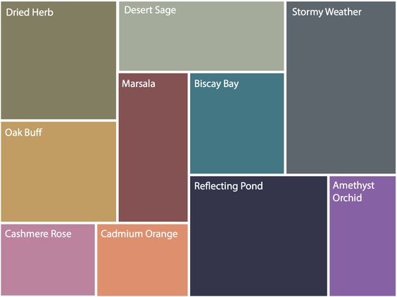
These 10 colours are the predictions from Pantone. We have seen some of these tones in recent years or similar tones like Amethyst Orchid, Cadmium Orange and the Biscay Bay are very similar to Radiant Orchid, Tangerine and Emerald.
This colour palette is a great blend of some summer hues and richer fall hues. These colours (more or less) all work together but in some unexpected combinations. For example mixing an earthy shade like Dried Herb with a soft pastel like Amethyst Orchid. The possibilities of visually interesting combinations are endless.
So how can you use these #Fall2015 colours at home?
Well, most of us likely have one of these neutral tones in our current decor – maybe a large furniture piece like a sofa or a wall colour. If that’s the case, build on that neutral piece by adding art or accessories or even textiles like pillows, rugs or even drapery with some of the more colourful, punchy tones.

Here’s a very simple example of mixing the dried herb and the orange in accessories.
Look for some statement pieces that combine the colours together! We love this leaf motif area rug that blends – biscay bay and stormy weather. With some white and soft aqua for contrast balance. But this would look great in a living room or bedroom with shades of grey and some pops of biscay bay (and other members of that ‘teal’ family)

We love what art can do to a room. Especially over sized art! It makes a room look expensive but also complete. An art piece is a great way to pull a colour scheme together or even add an unexpected pop of colour! The image below is a great example of a neutral and class colour combination and adding a piece of art with colour – it totally changes the space! This combines the reflecting pond and the amethyst orchid and cashmere rose.
When it comes to using colours that area trending you don’t have to have the exact hue, but keep it in the family.
Use the trending colours as a guideline – it’s a great way to come up with something new and fresh!


interiors.kiki
You May Also Like


