Browsing Tag

interior decorating ideas

small-accessories-guide-how-to-subtly-change-the-home-in-big-way

Often, we become a bit tired of our house looking the same old way, day in day out. We yearn for changes but don’t have the time or the budget to do anything drastic on a large scale. The good news is that we can make lots of small changes that all add up to something special. Check out these fantastic suggestions.

Art & Ornaments

We could go down the usual route of buying some prints we like from Walmart or somewhere similar, but that shows little imagination, doesn’t it? We could use a multitude of pictures and portraits to create a gallery wall. Other options include using stencils to create exciting patterns or even going to paint a mural if you are artistic. It is even possible to have custom wallpaper made up.

Shelves & Storage

What type of shelves and storage we use may not immediately seem like the type of choice that says much about our style, but they can make or break the mood of a room? Consider the most basic storage we can think of? Perhaps we could use cheap plastic storage boxes stacked along the wall; this would work in a garage or storage unit, but it’s not aesthetically pleasing at all. There are many better choices, and we should consider both the style and our taste. 

Books & Other Media

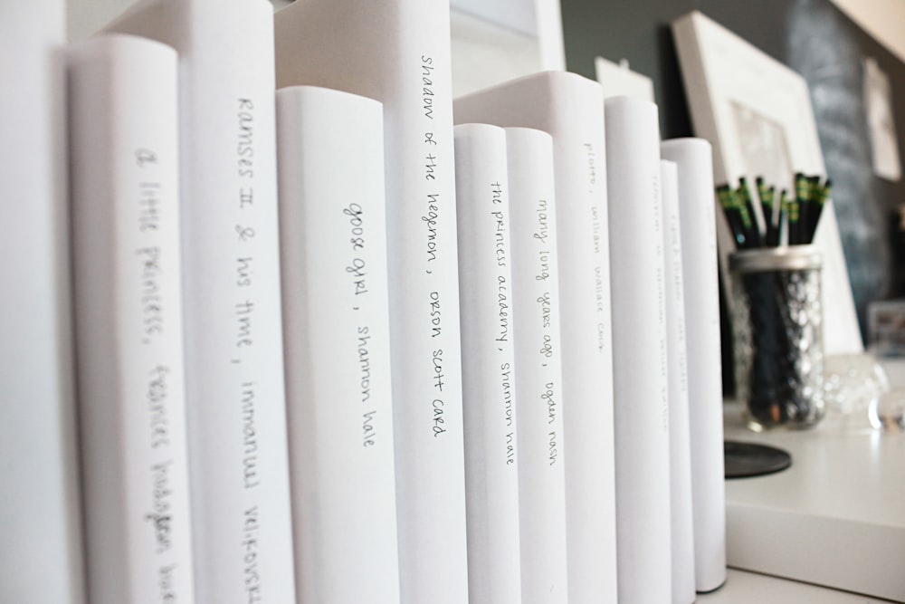
We cannot talk about shelving without having an idea of what we should put on them. The type of books, music, and other media we store on our shelves can say much about our personality. For others, it is ornaments or personal possessions. If storage were just about keeping our possessions in place, we wouldn’t bother, but it signifies what we are into.
Kitchen Tools

Sometimes we can be forgiven for thinking of the kitchen as purely functional, but there is a lot more to it than that. Creating food for the family takes up much more of our time than we realize. Even something as simple as this iron brush can look good if in keeping with the room’s theme overall. We should keep this in mind whenever we are purchasing anything for the kitchen. We could keep the kitchenware on a consistent style in many ways; by brand, by colour, or even by style and design. Consider we have an old farmhouse, and the kitchen is styled in a very traditional way; all of our cookware and other items must keep to this theme.

Eating Area

Somewhat connected to the kitchen, often literally, is the dining room or eating area. Some houses these days choose not to have a dedicated eating area and decide to have dinner in front of the TV, but for me, this is a big no! Sitting down to dinner can often be the only opportunity we have as a family to have a proper conversation about our lives and what we have been up to? These opportunities are invaluable and cannot be substituted for by anything else.

Subtle Themes

We have touched on the idea of themes up until now, but this is really a subject that requires some dedicated discussion. When discussing our potential kitchen ideas, we floated how we might buy items for a kitchen in an old farmhouse-style property; let us consider other ideas as well, what if we are living in an inner-city apartment. It is possible we could lay out the interior of such an apartment with décor that would normally be present in an older build, but it would be a bold move. A much more appropriate design would be to look to a modern and slightly minimalist look. The key in achieving a minimalist look is the effective use of space and light. Clutter is generally something we would always look to keep to a minimum, but to be minimalist is a step further than that. We must keep everything simple; if we consider the colour scheme, then it will not do to have too many involved; as little as two will look good. We must have space in between furniture, shelves, and artwork on the wall. It is essential to take a brutal and unwavering attitude to this style of decorating.
Door Handles

This may sound like something that is daft, to highlight door handles with a section devoted to such a small part of the house. It is possible that in many ways, no one really notices door handles, but you would certainly notice if they were wrong or out of place. What we are actually saying with this point is that you need to be mindful of all aspects of the house, no matter how small they might first appear.

House Numbers, or Name

Speaking of doors and entrances, we can also make our style be known by how we present the house number or name. There are so many ways we can subtly modify our house signifier. The first choice to make is whether we go for numerals, or the number spelled out in words? Using words can add a touch of class to the simple job of marking your house. But to take it a step further we can give our house a name. It is very easy to do as we are not actually required to change anything legally; we are simply referring to the property by a different name. You can pick a name in many different ways, it could 

Plant Life

If we add a splash of green, it always livens the home up. House plants are a great way of connecting with nature and making the house feel natural and smell great. It can give a fantastic sense of achievement to see something we’ve looked after grow and thrive in our home. Plants can be a lot of work if we keep a lot, but others are virtually no work at all, take cacti as an example; they barely need water and pretty much are self-sufficient.

0 comment
Share:
7-tips-to-protect-your-beautiful-home-interior

You’ve put a lot of time, effort, and creativity into creating a beautiful designer-style home interior. Just looking at the results gives you a good feeling, but now that interior decor has to stand up to its greatest test: the rough-and tumble of daily life. Keep it gorgeous for longer with these handy hints and tips. 

1. Take Precautions Against Plumbing Mishaps

Running water is a wonderful thing – but not when it’s running through the ceiling and all over your stunning decor. Burst water pipes and water heater disasters can all-too easily turn your home into a flood zone causing untold damage to furniture, ceiling boards, and paint finishes. All in all, it’s best to avoid the nightmare altogether. In the first place, get expert advice on preventing burst pipes in your home. Even so, accidents can happen. If they do, it’s worth being aware that water damage restoration experts are out there. Call for help and see what can be saved or restored.

2. Protect Upholstery and Carpets From Mishaps

From careless kids to errant pets and those butterfingers moments when that glass of red wine slips through your fingers, it is possible to protect your carpets and upholstery from mishaps, thrills, and spills. Knowing that little accidents can be easily cleaned up will be a big stress-saver. When it comes to stain protection, Scotchguard is the big name that everyone knows and trusts – this is no sales pitch, but it has to be said. If you can find a good alternative, feel free! Either way, being able to relax and laugh off little slips that would otherwise cause costly damage is a plus that will make your and your family’s home life pleasanter.

3. Ensure that Wood Finishes Can’t Get Water Marks

If you feel the need to rush around with coasters before anyone rests a cup or glass on a wood surface, it’s time to think about protecting wood so that it can’t get unsightly water marks even when there’s an unnoticed spill. You don’t need to spoil that warm finish – it’s just a matter of finding the right product to repel moisture so that you and your guests can relax. There are plenty of options on the market. Enquire at your local hardware store, or look online to see what your options are.

4. Protect Walls From Scuffs and Scrapes

Presumably, you’ve taken the precaution of using high-quality wall-coatings that allow you to wash away the occasional grubby fingermark – but scuffs and scrapes are another matter. From bed headboards to doors that bang against walls when carelessly opened, it’s easy to spot the areas that are vulnerable. Protecting your interior wall finishes and maintaining those carefully chosen paint colors could be as easy as installing rubber stoppers in the right places. Look for possible problems areas and prevent damage before it can happen.

5. Invest In Sun Protection

Natural light is glorious, but the direct rays of the sun can fade fabrics and damage artworks faster than you might imagine. Keeping drapes closed spoils the feeling of airiness and freedom you get from having big windows that let the light shine in. Fortunately, there are many more ways to protect interiors against sun damage. These range from film coatings for windows to exterior awnings that let in the light but not the sunshine. While protecting your decor, they will also help to reduce your summer cooling bills. 

Do you need this kind of protection? Pay extra attention to South-facing windows (or, if you’re in the Southern Hemisphere, North-facing windows) and see whether the sun’s rays pose a risk to the longevity of your interior decor investment.

6. Maintain Leather

Light-colored leather makes a great style statement, but it can stain quite easily. Once again, your answer lies in choosing the right products. Look out for leather furniture waxes and conditioners that help leather to shrug off stains. It’s not just a matter of spills. The dye from denim or the natural oils of skin and hair resting against surfaces can create ugly, dark marks. Choosing darker coloured leather helps, but if you’ve gone for light shades, do keep your preventative maintenance schedule up.

7. Hello Kitty

Most of the time, cats don’t actually damage furniture – but if they take to claw-sharpening on the corner of your expensive couch, the harmony between you and your feline companion will be short-lived. Scratching posts offer an alternative, but cats don’t necessarily feel the need to think the way we do. There are ways to train cats not to scratch furniture, but while you’re working on it, you might want to consider unobtrusive couch corner protectors or thick throws to protect that upholstery.

Nothing Lasts Forever: When it’s Time to Freshen Up your Interior

You’ll know when it’s time to freshen up, but do check out ways to refresh or restore items that are starting to look a little tired. In many instances, it is possible to give good quality furnishings a new lease of life. Consider doing a few simple repairs even if you want a complete change. The resale value of your furniture will be much better if it isn’t looking too tired – and the proceeds can go towards your next decorating project.

SHOP HOME DECOR NEUTRALS….

0 comment
Share:
7-secrets-from-an-interior-designer

In the digital age, it’s easier than ever to design a well-organized, cohesive decor scheme. With some internet inspiration and a few simple guidelines, you can make your home look like you hired an interior designer.

Here are some helpful tips to guide the process.

Plan Ahead

One of the key elements of stunning interior design is planning out the various components before getting started. You can do this by spending an afternoon looking at design magazines and clipping images that inspire you. You can also use tools like Pinterest to create a vision board. 

Outlining the design features of your room will also help you develop a shopping list and budget. Give yourself time to shop around and compare prices. 

Choose Statement Pieces

Generally speaking, an interior designer will incorporate one or two statement pieces into each room. These pieces become the focal point of the design scheme with the room working around it. A statement piece could be anything from an ultra-modern couch to an elaborate chandelier. 

Remember that statement pieces are meant to stand out, rather than to blend into the background, so leave your preconceived notions about matching at the door. While the piece should fit into the overall decor, use a pattern, shape, or color contrast to help it stand out.

Keep the Layout Simple 

When it comes to interior design, less is more. Having too much in one area makes the room look smaller and cluttered. Everything in your room should be functional as well as fashionable.

Take some time to declutter and experiment with the room layout. You can use a room planning app to see how everything will fit before making any significant changes.

Focus on the Finer Details

It’s the finer details that make the most impact when trying to make your home look professionally designed. For example, adding custom hardware to RTA cabinets in the kitchen completely changes the look of the room (check out RTA Cabinet Reviews). In a living room, the pattern on throw pillows can take the room from mediocre to luxurious. It’s all about the little touches.

Build Over Time

Don’t feel as though you need to handle your design project all at once. You can make small changes over time to fit your budgetary needs and overall vision. This approach is great if you’re waiting to find that perfect finishing piece for your room as well.

Building over time will also help you create a unique look as trends continue to change. By doing so, your room will look less cookie-cutter and more professionally planned. 

Use a Color Wheel

A color wheel is both the simple and most powerful tool to have on hand when creating a designer-inspired room. This device can help you find contrasting and complementary colors that you might not have considered. If you have a favorite color in mind, this tool can help you build around it without risking clashing or being too matchy.

There are plenty of apps and websites online that replace the handheld color wheel, and can even print paint codes for you to take to your preferred paint store. 

Prioritize Lighting

Lighting is the element that brings a room to life. Don’t just focus on the colors and patterns; consider how you’ll set the ambiance. Getting as much natural light as possible is a must. Many designers will use mirrors and reflective surfaces to improve light distribution.

Light fixtures also play into the overall look of a room. Choosing warm lighting that reduces hard shadows can make the room look more welcoming.

With these tips, you can create a house that looks as though it was put together by an interior designer. Get organized, be creative, and add a unique flair that sets it apart.

SHOP HOME DECOR….

0 comment
Share:
10-ways-to-effectively-add-decor-to-your-home

Are you looking to breathe fresh life into in your home? Adding new decor will transform your rooms and make them more soothing and energizing. The good news is it’s very easy to add style to every corner of your home with some well-laid plans and a few accessories.

  1. Pillows, pillows, pillows

Pillows can add personality and color to any room. They can also be quite useful. A good place to start decorating with pillows is in your living room. Does your couch look a bit boring? Adding a few throw pillows will help liven it up. Look for pillows that bring contrast to the fabric on the sofa. The contrasting colors add more visual appeal to the room.

The bedroom is the next place to experiment with pillows. You don’t have to pile a dozen pillows on your bed to make it a designer’s dream. Add a couple of pillows in fun fabrics. This can help draw the eye towards the bed, making it the room’s focal point.

  1. Add paintings and art to your walls

Blank walls can be intimidating when it comes to decorating your home. However, adding paintings and art to your walls will give the room some visual energy and coordination.

Walk through your home and figure out where paintings will have the most impact. Common places to display paintings and art include over the fireplace or couch. Look for long walls that need a bit of color and vibrancy. A painting can even adorn a wall in a guest bath.

  1. Frame and display personal photos

One way to make your house into your home is to bring to bring out your personal photos. These pictures of your family and friends will give your home a warm and cozy feeling for anyone who visits.

Now, displaying personal photos doesn’t have to be boring. In fact, it can add a stylish touch to any room. Put some of your favorite memories in identical frames. Then group the frames along the wall beside your staircase or down the hall. The identical frames provide visual coordination and style.

  1. Add a new coat of paint

Every few years most rooms require a fresh coat of paint to look their best. However, painting an entire room is not the only way to use paint to embellish the look of your home.

Consider adding an accent wall to draw the eye to a particular place in a room. You can go with a contrasting color or just paint the wall a few shades darker. Paint your front door a brand new coordinating color. This will help draw visitors to your entry and give the house a bit more curb appeal.

Try painting an old piece of furniture a bright fresh color. You can give any room a pop of color with the furniture transformation. You can also salvage old furniture pieces that look bad but are still in good structural condition.

  1. Place blankets in key locations

Blankets can be both decorative and functional. A warm blanket draped over the back of a sofa in front of a fire draws a person to snuggle in for the night. Adding a blanket to the end of your guest bedroom makes it more inviting for your guests.

When selecting blankets, it is important to consider their style and their intended use. A heavy blanket is great for winter nights but may be too much for a spring evening. A blanket with an antique pattern might not fit into your modern designer room.

  1. Upgrade your countertops

When you walk into a kitchen, the last thing you want to see is peeling Formica countertops. Those old plastic coated countertops look and feel tacky after a few years. Natural stone is the preferred replacement option.

Visit a store that specializes in natural stone to get some ideas. You can find a wide selection of stones including marble, quartz, and granite. Each slab of stone comes with its own unique beauty since no two are alike. You get the fun of looking through the selection and picking out the slab that you think will fit your home best.

  1. Create a memorable entryway

Where is the place your guests go through when they first arrive? It might be through the front door or maybe even through your mudroom. In either case, you want to make your guests feel at ease and comfortable. You can do this by giving your entryway a simple makeover.

The area should be clean and organized. Be sure to add a mirror where guests can have a quick glance. If you want them to remove their winter boots or summer sandals before going any further, give them a comfortable place to sit. Add some personal decorative touches to finish the space.

  1. Bring in seasonal touches

When it comes to seasonal touches, a lot of people think about the fall and winter months. But, bringing in items for each season helps keep a room feeling current and fresh.

Fresh flowers and blooming branches are a great way to bring in a touch of spring. Trading your heavy winter drapes for light flowing ones are a great way to celebrate summer. Of course, shades of orange and red are perfect for autumn, while ice, snow and the Holidays round out the winter.

  1. Add rugs to your floors

Rugs are items some people forget when it comes to home design. It may be that much of the house is carpeted or that the homeowners value a minimal design. Rugs, however, can work in any situation.

You can put rugs on any floor, including ones with carpet. A well-placed rug can bring a conversational area together. It can give guests a soft place to put their feet. It draws the eye to a particular location on the floor. It allows you to play with shapes and textures. It can also be a designer’s inspiration for the entire room.

  1. Get creative with textures

Texture appeals to the senses. It gives a space visual dimension and brings a luxurious feel to a bland room or set the room’s mood entirely. Repeated use of texture can harmonize a room.

The fun part of texture is that you can use it evoke different emotions and moods. An exposed brick wall offers visual texture. A woven textile brings warmth. A concrete countertop lends an industrial vibe. A fluted column brings a classic touch. Linear molding soothes a person.

Each of these options will help you transform your average home into a designer’s dream. Just remember to give yourself the time to plan what you want to add to each room and which items would work the best.

And always have fun with it!

1 comment
Share:
westpark-master-bedroom-project

I’m working with a client right now and we have been decorating her new home. It has been so much fun! Right now we are almost finished with her master bedroom. We have selected, ordered and placed almost all if the pieces – but we still have not decided on a rug. The look for her bedroom is soft, soothing and a beautiful space to relax at the end of a long day.  We opted for furniture with slightly darker than natural wood tones (but we wanted the wood look). The headboard is upholstered with tufting details and a wingback which adds so much presence in the room. The table lamps and accent mirrors will be flanking the bed for his and hers plus balance in the room.  The bedding is slighting more feminine with a modern floral motif but the grey and white tones keep it looking gender neutral.  The soft pop of lavender adds a splash of colour but it is soothing.

Shop the Master Bedroom Look

  1. Upholstered Headboard
  2. Accent mirror
  3. Table lamp
  4. Accent pillow
  5. Decorative succulents (faux)
  6. 2 drawer nightstand
  7. Bedding set

Master Bedroom area rug options

So this is where we are a bit stuck. There are so many options that we love and we just have not decided on one area rug yet.  The floors in the bedroom are a medium stained oak hardwood.  The area rug will not cover the hardwood completely but area rugs always help to define and anchor a space.

  1. Arana Hand-Tufted Area Rug
  2. Makenzie Woolen Cable Hand-Woven Area Rug
  3. Marcelo Hand-Woven Area Rug
  4. Hillsby Area Rug
  5. Arviso Hand-Woven Wool Area Rug
  6. Brandt Dark Grey Area Rug

Help us decide and let us know your favorite for this master bedroom!

BEDTIME FAVOURITES….

0 comment
Share:
5-amazing-dining-tables

We are so thrilled and happy to host a new guest blogger this week – Mark from Foosballzone.com

5 dining tables that are insanely awesome

A dining room is where the whole family sits and spends time together over lunch or supper so it is essential for them to feel good. With an astonishing dining table, you can make the whole space look amazing.  Due to that, I have made a rundown of 5 extremely stunning tables which will draw your family in the dining room. One thing you must keep an eye on is the fact that tables like those are not for everyone. Having an amazing table like that is a statement and you should be proud if you are looking to get one of the tables from the article:

Millenium Bontempi

The Millenium Bontempi is a dining table made for contemporary homes of individuals who value basic plan. Just by looking at the table you can see that it doesn’t have any excess decorations and it looks absolutely amazing. There are two shapes of the table; rectangular and roundabout shape so you can pick the table to fit your room. What I like the most is the fact that it is produced using one material. You can pick one from 3 materials: wood, glass and steel. The greatest highlights of the table are the legs. They aren’t in the corner of the table; they are in the middle of it.

Concrete table

The concrete table is a standout amongst the most fascinating dining tables on the market, but it comes with a catch.  It is challenging to locate the perfect one. The concrete table must be smooth, equally hued and with no breaks. That means that you don’t do that alone, you leave it for experts. The ideal blend you can discover that comes with a concrete tabletop is wooden legs. A table like that is impressive dining furniture and it is for a modern house.

Foosball dining table

Another dining table made for the bachelor’s apartment is a foosball dining table. Remember this isn’t just a foosball table with glass top, it is a table made to be a dining table. A table like that will leave an impact on everybody who comes into the room, including the ladies. A dining foosball table like this one has style and class. A tempered glass over the field is lifted because the height has to be like on the real dining table. The glass covers the rods so you won’t hit them while eating dinner.

Swing dining table

I can completely picture this table in a lunchroom in Google since it speaks to the casual environment you need to have in a lounge. It is made for individuals who are kids at heart and I am certain beyond a shadow of a doubt that this table will make you smile. Awesome for family dinners because it is a rare opportunity to see your grandmother in the swing! The table is completely safe and it has enough room between the swings so you won’t feel cramped.

Driftwood dining table

This table may not be modern, but it is absolutely amazing. A driftwood table is extraordinary furniture for any home since it tells to you its story. It would be a disgrace to put the driftwood table in little lounge area so I would propose putting it in an open space kitchen/lounge area. With tempered transparent glass on top a driftwood table, the extraordinary wood will be visible forever.

Author bio:

Mark is a blogger who has a blog about foosball tables. On his blog he shares all that one foosball player has to know, including the posts about various foosball tables like the one you can look at this link: http://www.foosballzone.com/sportcraft-foosball-table/

2 comments
Share:
2018-colour-of-the-year

It is that time of year where all of the fashion and home design experts are making their predictions for what will be the hot colour of the year…. Benjamin Moore has already announced their pick for colour of the year for 2018….Caliente – and just like the name suggests this colour is red hot.

More about the colour of the year….

This colour, Caliente, is hot, sexy and has lots of bold personality….this red hue has a touch of orange so it is a bit of a departure from the purple based wine tones. For anyone who is drawn to rich and warmer tones, caliente is Perfect!

Photo credit: Architectural Digest


The experts already were way ahead of this announcement and started to declare red as the new ‘millennial pink‘ over the summer months….

Red is a great next step from millennial pink….it is bold, a little unexpected in certain places (a red kitchen island….) . It can add a lot of richness to an exterior. It can be both feminine and masculine  depend on how you use it in your space.

How to decorate with the colour of the year…

This colour is so versatile … you can add this colour in a modern space that needs a colour injection but you can also make this work in a country or nautical inspired theme.  A Persian rug in this rich hue is another way to add this tone and some sophistication into any space.

Red Rug

This boho inspired room is so relaxed and the red makes a statement without taking over the space.  this room really combines a mix of styles like modern and traditional along with some great texture.

Photo credit: Havenly.com
 Add a touch of red with some pillows – a solid red pillow might be too much red so opt for some pattern … This living room styled by Pottery Barn has a great mix of boho and fresh coastal
Photo credit: Pottery Barn

 Red Furniture

 You can add a bold punch to your space with some red painted furniture.  This lake house bedroom is fresh and colourful with painted red twin beds…
Photo credit : Country Living
 

 Red sofa

Alright this is for someone who is really looking to e bold in their home decor.  A red sofa makes a statement but if you love colour…why not go bold? Red is a great colour for a major piece of furniture like a sofa because it really does work with a lot of other colours…

Photo credit : House of Turquoise

 Red accessories

Red is a great colour to accessorize with! Switching up your accessories along with new trends is an easy and affordable to change up the look of your decor…whether it’s pillows in a living room or bedroom or some kitchen items.

Photo credit: HGTV.com

 What do you think of Benjamin Moore’s Colour of the year?

1 comment
Share:
room-reveal-farmhouse-powder-room

Well, my 4 weeks are up and it’s time to reveal my new farmhouse powder room!

It has been a busy 4 weeks – I have pushed myself out of my comfort zone and made a major transformation in my powder room. I love my farmhouse powder room and so have my friends and family.  The new look is truly incredible and I did not go over budget BONUS! Let me show what I did to create my farmhouse powder room….

A look back at my powder room…..

BEFORE

This powder room was dark and dull – the cabinets are right of out of 1981 and the whole room just looked blah…I really wanted to add a brighter colour, make the room fresh and have a farmhouse powder room.

My farmhouse powder room – what I did…

I knew I wanted a brighter and fresher feel in the room.  The big element here was paint.  I’m fortunate because I had almost a full can of a warm beige-y colour (it’s actually the same colour I have in my other 2 bathrooms) HUSH by Benjamin Moore This new colour on my walls has made a huge difference! The powder room looks so much bigger and brighter (honestly I still cannot get over how fresh it looks).  The next paint project was painting that vanity! I love the look of chalk paint and I thought to get the farmhouse look a chalk painted vanity would be perfect! I chose a great chalk paint colour from Rustoleum ‘Country Gray’ and I love it!!

I was going to paint my existing hardware but after doing some looking around – I found these bar pulls in an oil rubbed bronze – they have a more modern look than my old ones, they are a great price and I had room in my budget so it was perfect! I did have the brushed nickle in my cart but I then realized with my existing hinges (and limited budget) I should stick with the oil rubbed bronze – I love how this vanity looks like a piece of furniture with the new paint and hardware. These bar pulls make a big difference in updating my farmhouse powder room.


I have always wanted to do something with my window but I never really figured out what – I found an awesome tutorial for a new-sew window valance and that was the plan but then I found this valance at Target – it fit in my budget and the colour is perfect! The rod was a great deal, too!


What I didn’t get done…

I purchased some spray paint that was supposed to be used for my counter tops – it has not yet arrived so this did not get done during the challenge.  I’m a bit disappointed as I was really looking forward to changing it but now that everything else has been painted – I’m not sure that I need to paint it! I’ve asked friends and family what they think and it’s a 50/50 split of whether to paint or not – let me know what you think I should do, I’d love to hear your thoughts…..


Styling my farmhouse powder room….

I lucked out with some art from my sister that she was no longer using.  I also have this old wood ‘mailbox’ piece that I purchased years ago and I have always loved it but never found a home for it – it has been sitting in my office collecting dust for about 6 years – it is a great piece that works with the farmhouse look I am after so I was super happy to give it a ‘home’. I used this amazing product called ‘Gorilla Hooks’ to hang it – so easy!

I also had some decor items here that were just sort of extras like the wicker basket with my ‘guest towels’, the large mason jar with some faux greenery that I took from an arrangement in my dining room (just two branches), I had the ‘iron’ owls from my family room.


I used some white bar towels for my guest towels and rolled them up and put them in the basket -so simple – but that’s what farmhouse is all about, right?

My towel bar, lighting and mirror were there before – but with the new paint they kind of look new, too!

Get a farmhouse powder room with only $100

So here’s my budget breakdown …

Chalk Paint                                        $24.64

New cabinet pulls                             $4.79 (x4)

Paint starter kit                                 $8.00

Curtain rod                                         $3.99

Curtain Valance                                 $10.99

Spray paint                                         $30.05

Mirror                                                  already had

Wall paint                                           used left over from my other 2 bathrooms

Art                                                        already had

Decor accessories and towels         already had

Gorilla hooks                                     already had

Total spent                                          $96.83

Even though I have not yet used or received my counter top spray paint I still included it in my budget – without it I would have only spent $66.78 !

Farmhouse powder room photos


I still cannot believe that this is the same room – the transformation is just incredible! I feel great about the end results and I feel great about all of the painting that I took on – there’s a first time for everything! When you ‘shop your home’ it is really amazing what you can find and what you can give new life…

Be sure to check out the other participants in this round of the $100 Room challenge – it is reveal week and there are so many amazing projects in this challenge –


7 comments
Share:
100-room-challenge-week-3-powder-room

3 weeks into this round of the $100 room challenge and I’m happy with the progress in my powder room….I am still amazed by the power of paint and how it can completely transform any room….take a look at how my powder room looked 3 weeks ago…

BEFORE

This is my second round of this challenge and it is so much fun! I love how it keeps me on track with my budget and focused on getting the project finished.  It is also really inspiring to see what other bloggers and IGers are doing. Did you catch Erin on the Rachael Ray Show? So many great ideas from Erin and all the other bloggers in this challenge – it is really fun to see how others stretch their budget and creativity! I have to say that this round I have ‘stepped it up’ from my first challenge.

Powder Room progress ….

Last week, I tackled painting the walls of the powder room and I’m loving the difference this ‘new’ colour has made so far.  I used paint from another project in my home and the colour is making such a difference already! I had to paint a second coat of paint on the powder room walls and if I am being honest – I wasn’t overly motivated to stay inside and paint.  Not because I’m not happy with how it is looking (quite the opposite) but….it seems like summer has finally arrived here and the weather outside is hot and sunny, so I really want to enjoy that while I can!

I did find that painting the second coat seemed to go much faster than the first coat – now maybe that is just me being motivated to get out and soak up some great weather!

I have also painted the vanity in this amazing shade of ‘country grey’ in a chalk paint! So exciting!! Originally, I planned on using a deeper charcoal tone for the vanity but my husband talked me into this mid-tone grey….I admit – this colour is a good choice – there is still contrast in the room and with this tone my new hardware pulls will stand out more!

I was going to recycle my handles (see below) but it was almost the same cost as buying new handles, so I purchased 4 new pulls instead.  The new ones are cleaner looking and still in the oil rubbed bronze finish (to match the existing hinges).  The new handles (although there are only 4) will give the vanity a fresh new look – I’m dying to install them!


‘Powder Room project’ confession time….

There have been a number of firsts for me on this project and I’m almost embarrassed to tell you but here goes….this my first time painting a room. ( Erin was completely honest about her DIY experience so I feel I should be, too.) Yep! I have painted my fireplace and a front door but never an entire room! I’m happy with how it turned out!

Something else I learned…how to patch the holes in my cabinets – this tutorial from Rainonatinroof.com is amazing and so simple….

Another first….I have never used chalk paint! I have to say I love chalk paint and I’m already trying to figure out what I can paint in chalk paint next! I was a bit nervous about it but it goes on so smoothly, the coverage is great and I love the super matte finish.  This has given my vanity new life! The image below shows off the new wall colour and 2 coats of chalk paint on the vanity – what do you think?

Yes, my doors are still attached to the ‘box’ of the vanity and I know the doors should be removed, painted and once complete, re-attached.  I didn’t realize the condition of my vanity until I started painting it this weekend – it is about 35 years old and it’s showing it’s age….I was worried that I may not be able to re-attach them. So I kept them on and painting them that way – not ideal but I’m making it work.

Counter tops…

Many of you have asked and comments about painting my counter tops. I am really excited (and a bit nervous) about painting my counter tops.  The paint has been ordered – I had to order online since all of the local stores were SOLD OUT! The paint has not arrived yet and it is cutting it close! I checked my order and it is supposed to arrive between Sept 20 (that’s today) and Oct 2…..so I may not get these counter tops painted before the 1 month timeline of this challenge is up….Well if I don’t get it on time – I will be sure to have a new post dedicated to painting my counter tops!

And I have to admit with all the fresh paint in this space – my counter tops that were already looking dated and dull look even more so….


Powder room to-do list:

  • prep and paint the walls of the powder room
  • paint or purchase 4 new cabinet hardware pulls
  • start (and finish) painting the vanity in chalk paint
  • install new cabinet hardware
  • hang up window treatment
  • touch up paint
  • paint counter top (waiting patiently for paint to arrive….)
  • hang up mirror and art
  • style the space with towels and greenery

The remaining items on my to-do list seem lengthy but it’s a lot of small jobs and I’m so excited to finish up this powder room, motivation will be driving me to get this done!

Budget so far….

4 new bar pulls for vanity ($4.79 each)

Chalk paint for vanity ($24.64 on sale!)

paint brush, roller and tray starter kit ($8.00)

counter top spray paint ($30.05)

curtain rod ($3.99)

I found a pre-made curtain valance for $10.99 at target so I purchased that instead of making my own but I want to try this DIY valance by 12 devonshire in my family room!

95.84 is the total spent!! Maybe I can find a cheap greenery piece at the dollar store!

Be sure to check out the other bloggers participating in the $100 room challenge…


Every time I pop into my powder room I just can’t get over the difference already – so I cannot wait to get this makeover done !

Next week is the room reveal….so exciting!

14 comments
Share:
100-room-challenge-week-2-powder-room

It is week 2 of this $100 room design challenge and let me tell you about the progress so far….

But first, let me bring you up to speed on the challenge –

I decided that my room that needed an update (that was over looked when we did some renos 6 years ago) is our powder room.  Our powder room like most other homes is a high traffic room with lots of visitors ranging from family to friends.  The room was dark brown with cabinets right out of the 1980’s (when our home was built) and some laminate counters.  With this challenge I decided to really focus on giving this powder room a fresh look with a bit of a farmhouse look.

Take a look at week 1 , HERE

BEFORE


BEFORE

Design challenge decisions…

I knew that this room needed paint – and pretty much everywhere. With a budget of only $100 I didn’t want to just spend that money on paint – this room needs so new decor accessories, maybe some towels too. Sticking to the budget and making a big change is really the premise of this design challenge. So for my wall colour –  I knew I had some paint from other painting projects in my house.  I had 2 cans of paint that were almost full – so I had to decide which of those two colours I liked best for the space.

Paint option #1 – Benjamin Moore ‘HUSH’ AF-95  This is a great warm neutral (my other 2 bathrooms are this colour, too) I’m not why I have almost a full can left but I did!

Paint option #2 – Benjamin Moore ‘JUTE’ AF-80 This is the colour seen in the main part of my home.  It’s a soft neutral a bit on the cooler side compared to HUSH.

I compared both colours in the powder room and decided on HUSH.  I like the warmth and the JUTE hue was looking a bit green and I’m really trying to downplay the green tones in my floor tile.

Now that my colour was selected, I was ready to start painting except I could not find my paint brushes ANYWHERE….I looked all over my house – the basement, the garage etc…no luck. So I had to buy some new brushes, I really did not want to spend any money from my budget on brushes but I really had no choice. I lucked out and found this great little ‘starter’ kit at Wal-Mart.  maybe not the best quality of brushes but this handy little kit had 2 rollers (one large, one small), a brush, drop cloth and the tray for $8.00

Time to get started on the challenge….

Paint colour is picked and now it’s time to start.  I wanted to get the paint colour on the walls first for a few reasons….1 – I wanted to see the colour on the walls since I was undecided on what colour I want to paint my vanity. 2 – The walls are the biggest painting job, so I wanted to get it out of the way.  3 – With the walls being so dark, I knew I needed to tackle those first as they would probably need the most paint and …4. I had the supplies on hand.

And so far, so good….

Already the difference is incredible…..

The first coat is done and I need another coat for sure but the difference is amazing.  The bathroom is SO much brighter and clean looking, too! My husband is loving it, too (usually he doesn’t say much when it comes to home decor)

Check out the other room makeovers in this challenge….


Next up…..

2nd coat of paint (possibly a third but only if necessary).

Painting of the vanity is next – I’m thinking a charcoal chalk paint….

Painting the counter tops (so excited to see how that turns out!!)

I like my vanity light and mirror – so those will stay …

I have some ‘new’ art from my sister (she always has decor stuff lying around…)

If my budget allows, I’m hoping to find some greenery (faux) to add some freshness to the bathroom

The budget so far is not blown so hopefully I can stay on track with the workload and budget…fingers crossed!

Let me know what you think of the change in my powder room so far….

15 comments
Share: